 Click to zoom
Graph Analysis Keynote Diagrams: Illuminating Architectural Insights
| Format | .pptx |
| Slides | 9 unique layouts |
| Aspect ratio | 16:9 |
| Compatibility | PowerPoint |
| Animated | No |
| Language | English |
| License | Commercial |
| File size | — |
| Version | v1.0 |
| Last updated | March 2023 |
What's inside
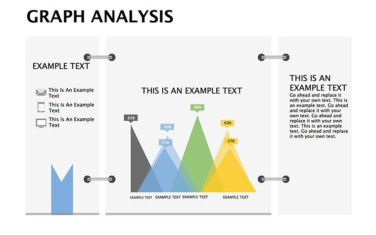
Behind every groundbreaking structure lies a web of data - foot traffic forecasts, material stress tests, energy yield projections - waiting to be graphed into gold. Our Graph Analysis Keynote Diagrams Templates bring this to life with 9 editable slides, empowering architects to dissect and display numbers with narrative finesse. Say goodbye to spreadsheet monotony; hello to visuals that vault your proposals from probable to profound.
Aligned with AIA's data visualization guidelines, these templates prioritize interpretability, turning raw stats into strategic stories for everything from feasibility reports to post-occupancy evals. Keynote's native prowess shines here: Smooth vector charts, interactive hotspots, and export-ready finesse make them indispensable for Apple-centric workflows. Whether charting solar gains in passive houses or occupancy curves in co-working spaces, these diagrams demystify metrics, fostering trust with data-savvy clients.
Versatility defines them - bar graphs for cost breakdowns, pie slices for stakeholder shares, scatterplots plotting wind loads against heights. Customize axes to reflect BIM outputs or trend lines for lifecycle analyses. Architects at firms like HOK have wielded graph-heavy decks to justify bold innovations, as noted in ArchDaily case studies. With drag-and-drop simplicity and theme harmony, your analytics ascend from arcane to accessible. Let's plot a course through their potentials.
Dynamic Graphs for Architectural Analytics
From granular site surveys to macro market scans, these diagrams adapt to architecture's analytical breadth, ensuring no datum goes dim.
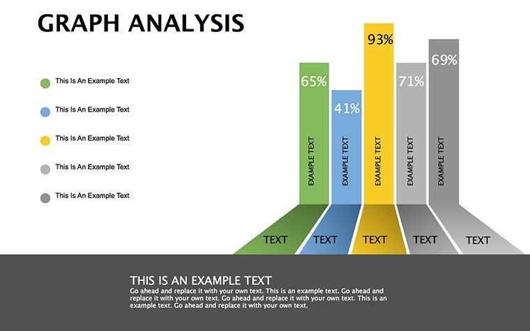
- Bar and Column Charts: Comparing facade options by thermal performance, bars rising like profiled elevations.
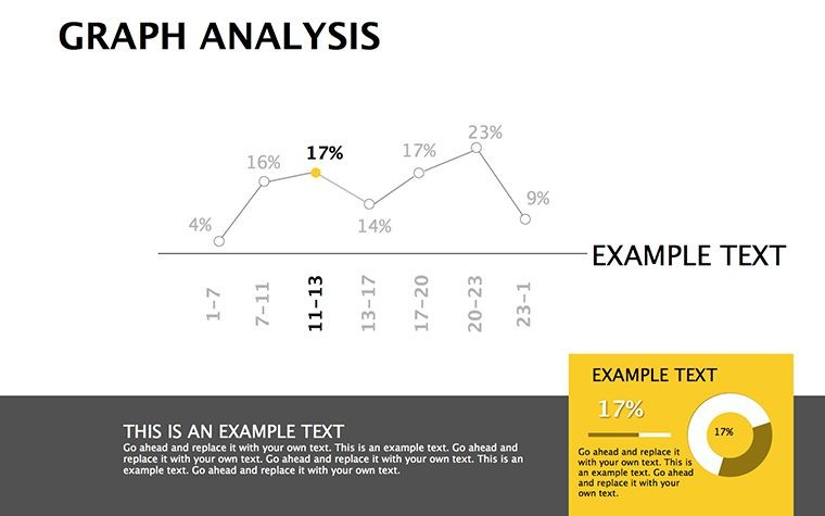
- Line and Area Graphs: Tracking project timelines with undulating lines, areas shading variance bands.
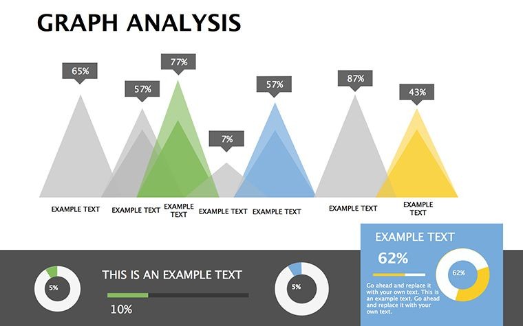
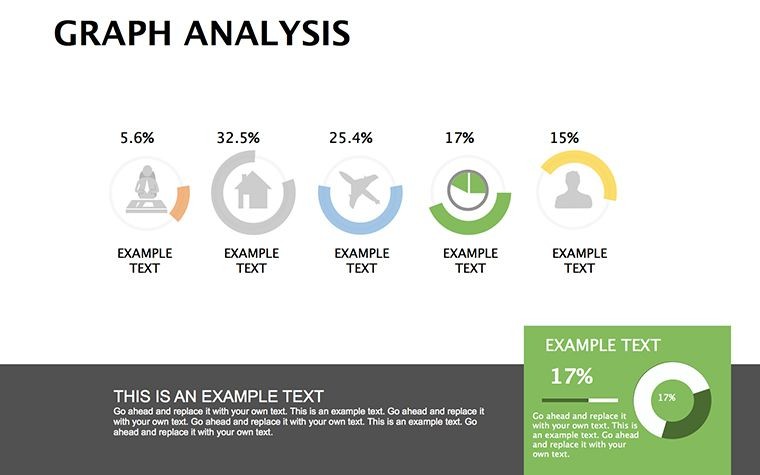
- Pie and Donut Variants: Allocating budgets circularly, with explodes for drill-downs into MEP allocations.
Histograms reveal distribution quirks, like room size variances in adaptive designs, all rendered with Keynote's crisp anti-aliasing.
Analytics Alchemy: Tips from Data-Wise Designers
Invoke Edward Tufte's sparkline ethos by embedding mini-graphs within text boxes for at-a-glance gains. AIA data dives recommend logarithmic scales for exponential growths, like urban density spikes - scale yours accordingly. Pro perk: Link charts to Numbers sheets for live updates during Q&A.
- Harmonize colors with your mood board for cohesive decks.
- Annotate outliers with callouts, spotlighting anomalies like seismic hotspots.
- Animate data points sequentially to build suspense in forecasts.
These maneuvers not only clarify but captivate, trimming misinterpretation risks in high-stakes reviews.
Graphing Glory: Architectural Anecdotes
Spotlight the Metro Retrofit Initiative, where graphs dissected ridership trends via line charts, influencing a $50M upgrade as profiled in Engineering News-Record. The visuals "plotted the path to progress," outshining narrative-only bids.
Indie architect Liam graphed material sourcing footprints, his scatterplots swaying eco-certifiers toward platinum status. Such sagas signal: Graphs ground genius, grounding flights of fancy in facts.
Superior to Spreadsheet Screenshots
Eclipsing pasted PNGs, these native graphs reflow with resizes, honoring AIA's responsive design ethos. No more misalignment woes; smart legends auto-adjust, preserving polish in iterative edits.
With table integrations for cross-tabs, they bridge qual and quant, enriching pitches with multifaceted metrics.
Synergizing with Keynote's Analytical Edge
These .key assets fuse with iBooks Author for interactive reports or Final Cut for video embeds. AirDrop shares keep collab circling, while 4K exports suit billboard briefs.
Leverage Build effects for data unveilings, mimicking metric manifestations. Compact sizing supports sustainable storage.
Chart your ascent? Download Graph Analysis Keynote Diagrams Templates today and graph toward greatness.
Frequently Asked Questions
Key applications in architecture?
Excel for data viz in reports, from cost analyses to performance metrics.
How customizable are the graphs?
Wholly: Alter types, scales, and styles to match your dataset.
Number of slides included?
9 comprehensive, chart-centric layouts.
Integration with other Apple tools?
Seamless with Numbers for dynamic data feeds.
Support for advanced charts?
Yes, including scatter and histograms for nuanced insights.
Good for
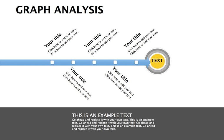
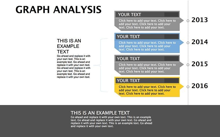
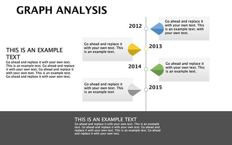
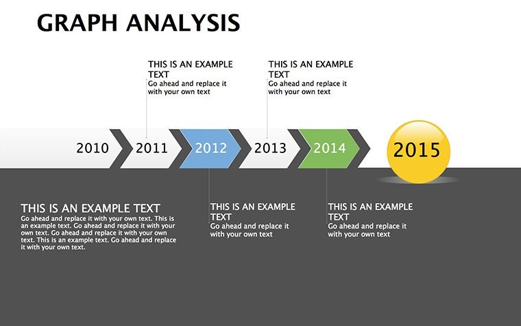
- Project roadmaps and sprint plans
- Product launch timelines
- Quarterly or annual review decks
- Company history and milestone summaries
Licence
reviews
Finished my presentation in like an hour because the diagram blocks were already there.
The circle graphics made my workflow slide easier to explain to the team.
It’s decent but some text boxes were weirdly placed when I opened it.
I used the timeline part for a school project and nobody complained.
Not really into design stuff but the layout was simple enough to edit fast.
FAQ
Will it work in Google Slides?
Are fonts embedded?
Can I use this for client work?
What's the refund policy?
Do you update the template after purchase?
Similar templates
See all Keynote Diagrams →
All 9 slides