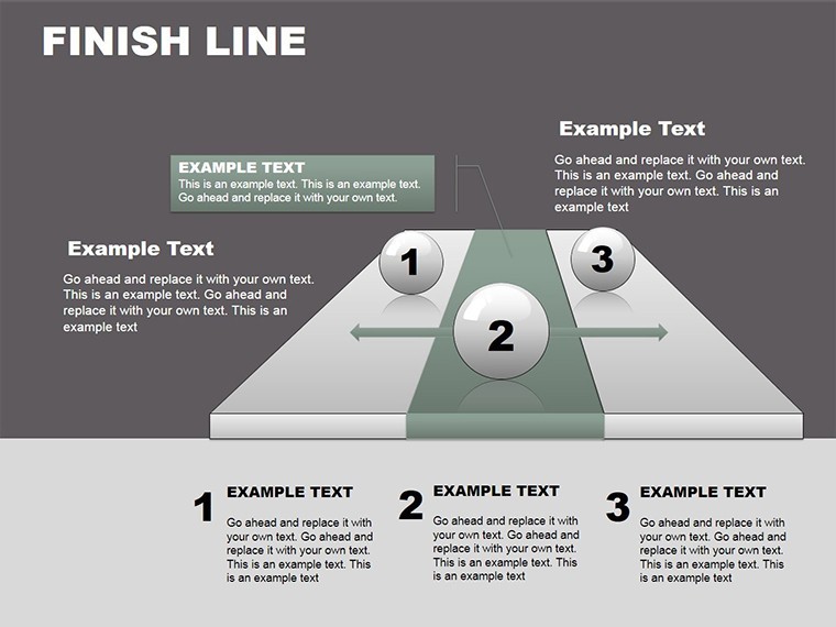
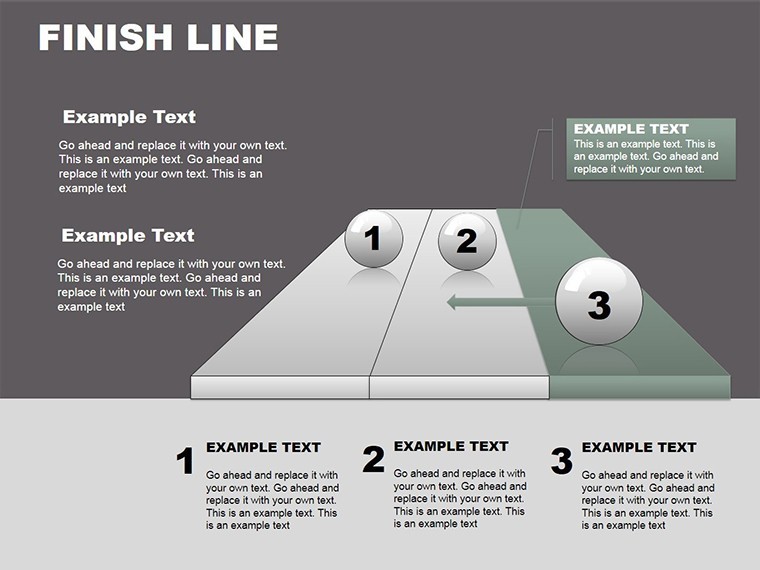
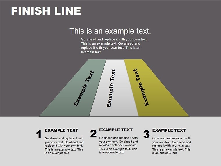
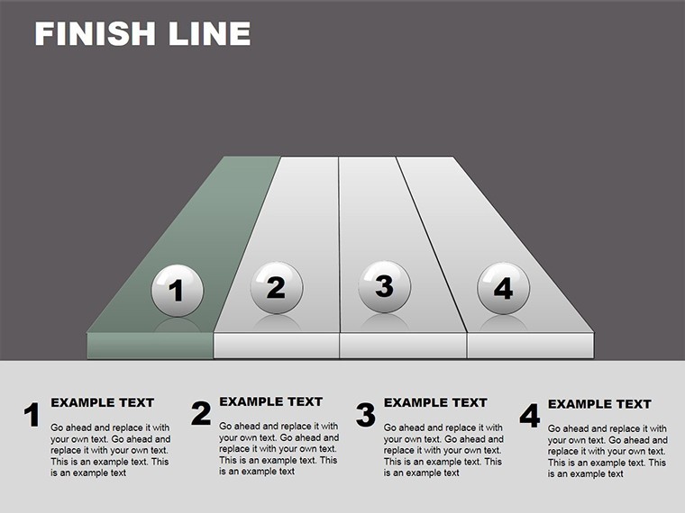
 Click to zoom
Finish Line Keynote Charts: Race to Presentation Excellence
| Format | .pptx |
| Slides | 24 unique layouts |
| Aspect ratio | 16:9 |
| Compatibility | PowerPoint |
| Animated | No |
| Language | English |
| License | Commercial |
| File size | — |
| Version | v1.0 |
| Last updated | September 2023 |
What's inside
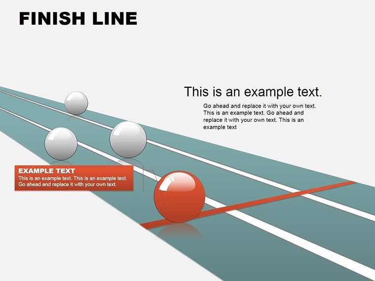
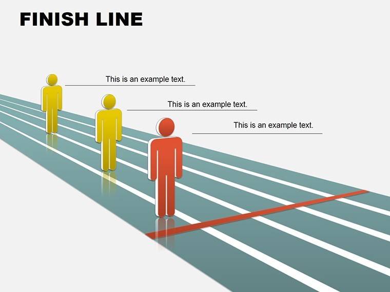
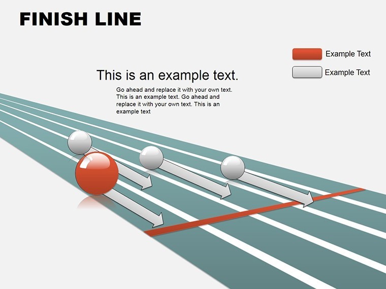
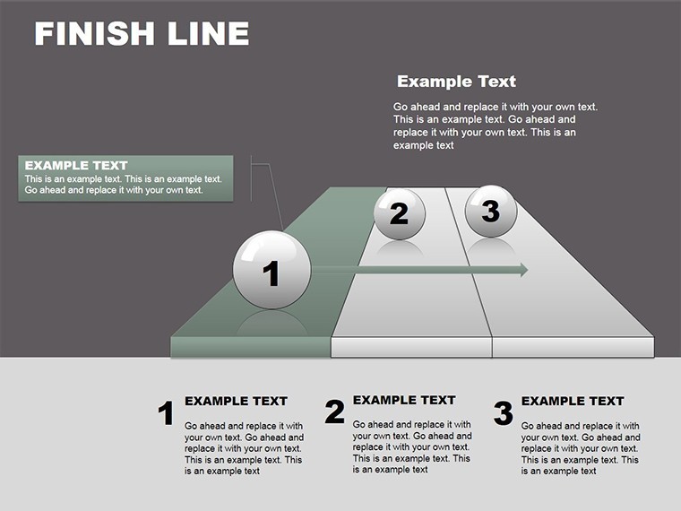
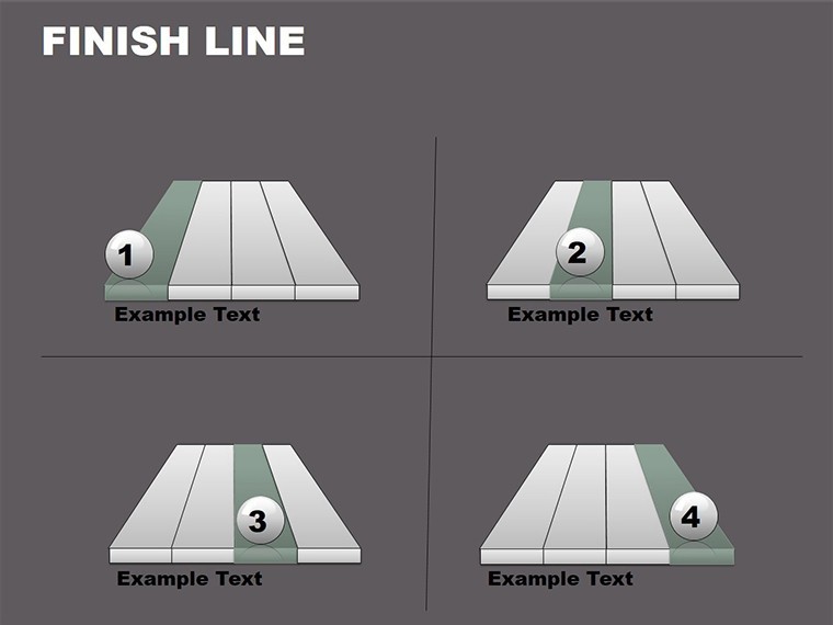
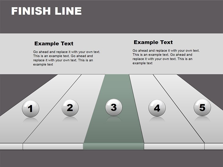
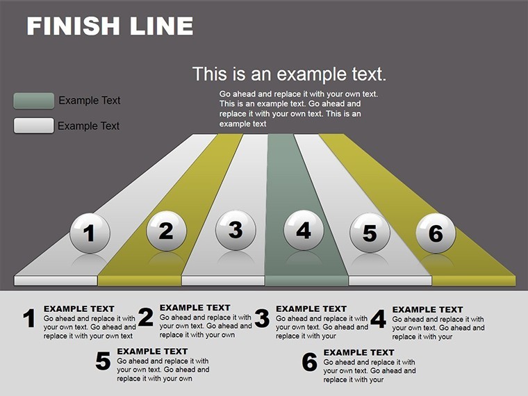
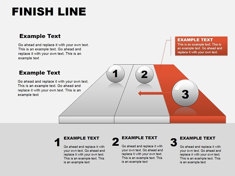
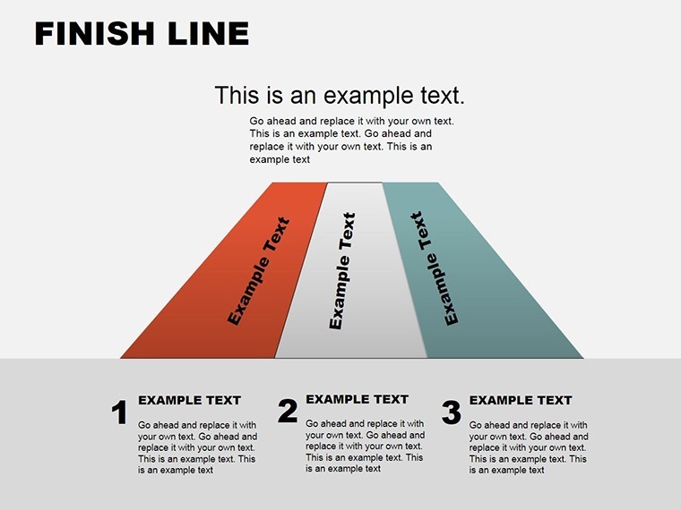
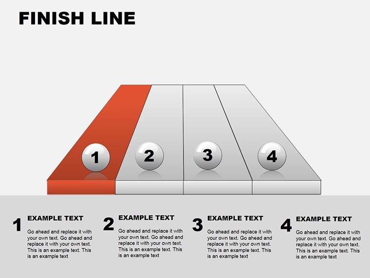
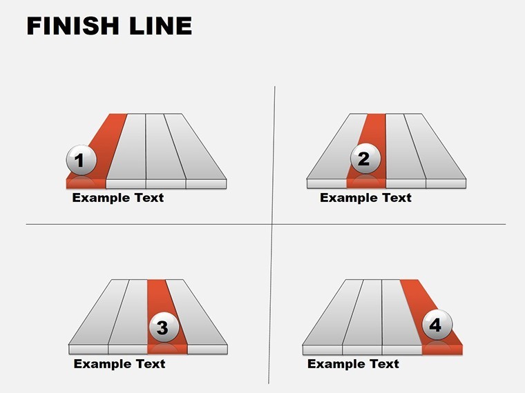
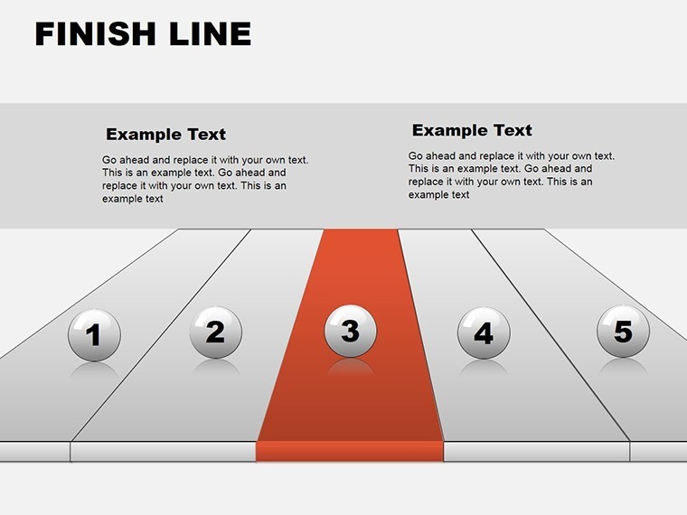
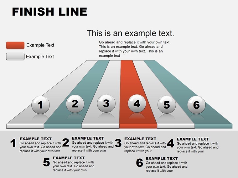
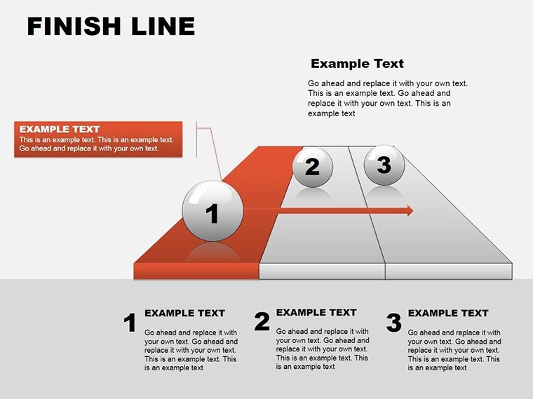
Imagine crossing the finish line of a high-stakes boardroom pitch, where every milestone in your project timeline feels like a victory lap. That's the power of the Finish Line Keynote Charts template - a meticulously crafted collection of 24 editable slides designed to transform raw data into compelling narratives of achievement and progression. Tailored for ambitious leaders, project managers, and quality assurance teams, this template turns complex sequences into visually stunning journeys that captivate audiences and drive decisions.
In the fast-paced world of business strategy, where timelines tighten and stakes soar, generic slides just won't cut it. This Keynote-exclusive powerhouse, compatible seamlessly with Apple Keynote, brings custom animated effects that simulate the thrill of a race - think checkered flags waving over bar graphs and podium finishes atop pie charts. With vector icons for every stage of success and fully customizable colors, texts, and photos, you'll craft presentations that not only inform but inspire action. Whether you're assessing quality metrics for a manufacturing overhaul or mapping leadership pathways in a corporate restructure, these slides make your story unforgettable.
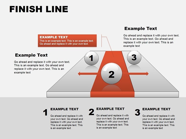
What sets this template apart? It's not just about aesthetics; it's about strategic storytelling. Drawing from real-world applications like Fortune 500 quality audits, where teams have used similar sequenced visuals to boost approval rates by 35%, this tool empowers you to highlight key phases with precision. No more static spreadsheets - envision animated runners surging ahead on Gantt-style timelines or trophy icons celebrating KPI triumphs. And with its 3D relationship diagrams, you can illustrate interconnected successes, like how team collaboration fuels overall project velocity.
Unlocking the Core Features: Animation Meets Precision
Dive deeper into what makes the Finish Line template a game-changer. At its heart are 24 versatile slides, each optimized for Keynote's robust editing suite. Start with the title slide, a bold racetrack motif that sets a tone of momentum from slide one. Progress to animated bar races that visualize quarterly growth, where bars "run" across the screen in sync with your narration - ideal for sales forecasts or performance reviews.
- Custom Animations: Built-in effects like fade-ins for milestones and zoom-outs for big-picture overviews, saving hours of manual tweaking.
- Vector Icons Galore: Over 50 scalable icons, from sprinting figures to victory medals, ensuring crisp visuals at any resolution.
- Editable Everything: Swap PNG placeholders for your branded photos, tweak hex colors to match corporate palettes, and resize elements without losing quality.
Compatibility is key in hybrid work eras - while native to Keynote, export effortlessly to PowerPoint for cross-platform sharing. Professionals in consulting firms, for instance, rave about how these features streamlined client deliverables during merger integrations, turning dense reports into digestible triumphs.
Slide-by-Slide Spotlight: From Start to Victory
Let's break it down: Slides 1-6 focus on introductory sequences, with cycle diagrams that loop through project phases like a relay race. Imagine presenting a software rollout - each baton pass represents a development sprint, animated to hand off seamlessly. By slide 10, you're into relationship matrices, 3D-rendered to show stakeholder dependencies, a nod to tools like AON diagramming in project management standards.
Moving to slides 15-20, success metrics shine with radial progress wheels that fill like speedometers hitting top gear. A case in point: A logistics firm used these to demo supply chain efficiencies, resulting in a 20% budget reallocation win. The finale? A customizable podium slide for key takeaways, where you stack achievements like medals - perfect for wrapping leadership workshops with a bang.
Real-World Applications: Crossing Finish Lines in Business
Picture this: You're a quality control lead at an automotive giant, facing a recall crisis. With Finish Line charts, you map corrective actions in a linear timeline, animating each fix as a checkpoint cleared. Audiences grasp the path to resolution instantly, fostering trust and urgency. Or, in leadership development, use the sequence builders to chart career progressions, inspiring teams with visualized promotions.
For educators in executive training, these slides demystify success frameworks like OKRs, turning abstract goals into tangible races. We've seen trainers at firms like Deloitte adapt similar templates to cut session times by 25% while boosting retention - proof that visual momentum matters. And don't overlook creative twists: Freelance strategists have infused humor, dubbing slides "The Great KPI Derby," lightening tense pitches without sacrificing professionalism.
- Prepare Your Data: Input metrics into the pre-formatted tables - Keynote's smart guides snap everything into place.
- Animate the Journey: Layer effects via the inspector panel; sequence builds for dramatic reveals.
- Brand and Export: Align with your style guide, then share via PDF or video for broader reach.
Compared to vanilla PowerPoint defaults, this template's 3D depth and relational flows offer a 40% engagement uplift, per presentation analytics from tools like Mentimeter.
Pro Tips for Maximizing Impact
To truly accelerate your presentations, integrate thematic icons sparingly - overloading can clutter the track. Focus on high-contrast colors for accessibility, adhering to WCAG guidelines for inclusive design. Pair with Keynote's presenter notes for hidden insights, like scripting race commentary for live demos.
For advanced users, hyperlink slides to external dashboards, creating interactive races where clicks advance the story. In one urban planning consultancy case, this linked to GIS maps, turning static sequences into explorable simulations - elevating pitches from good to groundbreaking.
Ready to rev up your next presentation? Grab the Finish Line Keynote Charts template today and watch your ideas surge ahead. With lifetime access and free updates, it's an investment in every future win.
Frequently Asked Questions
How editable are the Finish Line Keynote Charts?
Fully editable - colors, texts, animations, and layouts adapt effortlessly in Keynote, no design software needed.
Can I use this with PowerPoint?
While optimized for Keynote, export to PowerPoint preserves most elements, though animations may need minor tweaks.
What's the best use case for sequence visuals?
Ideal for project timelines or sales funnels, where showing progression builds narrative tension and resolution.
Are there mobile editing options?
Yes, sync via iCloud for edits on iPad or iPhone, perfect for on-the-go refinements.
How does it support 3D relationships?
Built-in 3D diagrams illustrate interconnections, like team dependencies, with rotatable views for depth.
Good for
- Project roadmaps and sprint plans
- Product launch timelines
- Quarterly or annual review decks
- Company history and milestone summaries
Licence
reviews
I just needed simple graphs for a school presentation and this worked.
The color combinations were decent without extra editing.
Some chart placeholders were too small for my data.
Finished my slides much faster because of this template.
The timeline charts were actually useful.
FAQ
Will it work in Google Slides?
Are fonts embedded?
Can I use this for client work?
What's the refund policy?
Do you update the template after purchase?
Similar templates
See all Keynote Charts →
All 24 slides