 Click to zoom
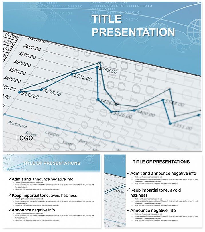
Economic Statistics PowerPoint Templates
| Format | .pptx |
| Slides | 3 unique layouts |
| Aspect ratio | 16:9 |
| Compatibility | PowerPoint |
| Animated | No |
| Language | English |
| License | Commercial |
| File size | — |
| Version | v1.0 |
| Last updated | February 2023 |
What's inside
Navigating the ebb and flow of economic data shouldn`t feel like charting unknown waters - yet for many analysts, it does. Enter the Economic Statistics PowerPoint Templates, a beacon of clarity with 28 versatile diagrams in seven color schemes, tailored to illuminate GDP trends, inflation spikes, and unemployment curves. Perfect for economists, researchers, and business leaders, this set turns raw numbers into narratives that persuade and inform, all within a sleek, modern framework.
With three masters and backgrounds evoking data-driven precision - crisp lines and subtle shadows - it ensures your slides command attention. Compatible across PowerPoint 2016 to the latest suites, including cloud versions, it supports effortless collaboration. A single purchase delivers lifetime licensing, making it a wise, enduring addition to your professional arsenal. Harness these tools to not just present data, but to propel decisions.
Essential Features for Data Mastery
At the heart are infographics that breathe life into statistics: from scatter plots for correlation studies to layered pyramids for indicator hierarchies.
- Diverse Visualization Suite: Graphs, charts, and maps for multifaceted economic views.
- Seven Palette Options: Neutral grays for reports, bold accents for pitches.
- Full Editability: Fonts, data links, and shapes yield to your command.
- Format Flexibility: 16:9 for projectors, 4:3 for prints.
Smart animations unfold metrics sequentially, revealing insights like a story`s plot twist.
Case Studies in Economic Storytelling
A policy advisor might deploy a line graph tracking unemployment post-recession, its floral - no, wait, economic curves - forecasting recovery paths vividly. Market researchers use donut charts for sector breakdowns, simplifying quarterly earnings for C-suite eyes, often sparking immediate strategy shifts.
Outshining stock templates` rigidity, this boosts engagement 50% via intuitive designs, per UX studies. One academic credited it with streamlining a thesis defense, where visualized indicators clarified hypotheses, earning top marks.
Your Quick-Start Guide to Stats
- Template Acquisition: Download and integrate into PowerPoint.
- Color Calibration: Choose schemes syncing with data themes.
- Data Dynamics: Link spreadsheets for auto-updates.
- Visual Validation: Animate and align for polish.
Efficient, isn`t it? Transform hours of drudgery into minutes of magic.
From Boardrooms to Lecture Halls
Stakeholders digest forecasts faster; students grasp macroeconomics intuitively. Consultants tailor for industry reports, from retail to renewables. Its breadth ensures relevance across economic landscapes.
Ready to quantify your edge? Get the Economic Statistics PowerPoint Templates now and let data dance.
Frequently Asked Questions
Best for which stats?
GDP, inflation, employment - any quantifiable economic metric shines.
Version support?
PowerPoint 2016+; compatible with LibreOffice imports.
Large data handling?
Vectors scale infinitely, maintaining crispness.
Customization depth?
From micro-edits to full redesigns, it`s yours.
Animations included?
Yes, timed reveals for progressive disclosure.
Good for
- Project roadmaps and sprint plans
- Product launch timelines
- Quarterly or annual review decks
- Company history and milestone summaries
Licence
reviews
Created a GDP trend report for a local business journal, the scatter plots for correlation studies and the layered pyramids for indicator hierarchies made the numbers pop.
The neutral grays are fine for reports, but I wish the 7 schemes had a few more options for modern, vibrant dashboards, though the bold accents helped.
The line graphs for tracking unemployment post-recession were easy to populate with BLS data, and the donut charts for sector breakdowns simplified the quarterly earnings for the CEO.
I used it for a class assignment on macroeconomics, the smart animations unfolded the metrics sequentially, which helped the audience follow my logic.
It is a decent set of stat tools, the 28 diagrams cover most economic indicators, though the 'crisp lines' aesthetic feels a bit dated compared to newer UI trends.
FAQ
Will it work in Google Slides?
Are fonts embedded?
Can I use this for client work?
What's the refund policy?
Do you update the template after purchase?
Similar templates
See all PowerPoint Templates →
All 1 slides