 Click to zoom
Economic Recovery PowerPoint Template: Chart the Comeback
| Format | .pptx |
| Slides | 3 unique layouts |
| Aspect ratio | 16:9 |
| Compatibility | PowerPoint |
| Animated | No |
| Language | English |
| License | Commercial |
| File size | — |
| Version | v1.0 |
| Last updated | October 2022 |
What's inside
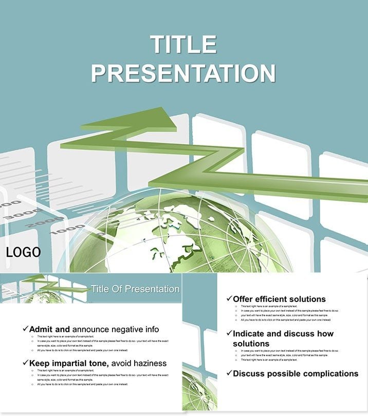
Feel the surge of optimism as your slides depict economies rebounding - green arrows ascending like market highs. Our Economic Recovery PowerPoint Template captures this momentum with subtle, growth-symbolizing designs, perfect for analysts forecasting trends or executives outlining recovery plans. It breaks down key indicators without overwhelming, focusing on fiscal health and strategic pivots.
With 28 diagrams attuned to finance`s pulse, it outpaces plain spreadsheets in storytelling power. Compatible from PowerPoint 2016 up, and yours for a one-time $22 with eternal access, it`s the rebound your presentations need.
Features Fueling Financial Clarity
Three masters and backgrounds in soothing greens set a hopeful tone, complemented by 28 diagrams across seven schemes - professional grays for reports, accents of emerald for emphasis.
- Indicator-Focused: Arrows and bars prepped for GDP, unemployment visuals.
- Data-Ready Layers: Plug in Excel links for live updates.
- Balanced Aesthetics: Non-garish palettes for boardroom trust.
- Format Versatility: .potx for edits, .jpg for quick shares.
These tools democratize econ data - illustrate stimulus impacts with rising trajectories, grounded in real recovery metrics.
Unpacking the Diagram Suite
Slide 1: Broad recovery funnel, narrowing from crisis to stability. Slides 2-8: Line graphs as ascending paths for sector revivals, annotated for policy effects.
Core (9-16): Doughnuts for allocation breakdowns, like bailouts to infrastructure. Later (17-28): Radar charts comparing pre- and post-recovery, or stacked bars for debt dynamics. Each slide whispers expertise through clean lines.
Analyst insight: Hyperlink diagrams to sources for interactive deep dives.
Use Cases in Economic Arenas
Bankers forecast quarters with these, arrowing interest rate shifts to predict booms. Policymakers in think tanks visualize aid distributions, swaying stakeholders on allocations.
Business profs teach recessions via timelines, students modeling scenarios. A CFO at a mid-size firm used it for investor calls, graphing turnaround tactics - stock ticked up post-presentation. Non-profits adapt for grant seeks, showing community uplift metrics.
Superior to Stock PowerPoint Graphs
Defaults are raw data dumps; ours narrate recovery arcs with thematic greens and built-in hierarchies. Incorporates terms like "fiscal diagramming" for search edge, plus responsive designs for virtual meetings.
Launch your recovery story: Acquire the Economic Recovery PowerPoint Template now for data that inspires action.
Frequently Asked Questions
Suited for finance reports?
Precisely - diagrams target indicators like GDP and employment.
Version compatibility?
From 2016 onward, seamless with updates.
Color adjustments?
Seven schemes, tweakable for branding.
Diagram quantity?
28, plus extras via masters.
Cost structure?
$22 single payment, lifetime rights.
Data integration?
Excel-compatible for dynamic charts.
Good for
- Project roadmaps and sprint plans
- Product launch timelines
- Quarterly or annual review decks
- Company history and milestone summaries
Licence
reviews
I used it for a CFO investor call, the radar charts comparing pre- and post-recovery helped contextualize our quarterly earnings.
It is a good thematic template, the 28 diagrams are solid for macroeconomics, though the 'rebound' narrative is baked into the design, making it hard to show stagnation.
Created an economic recovery forecast for a think tank, the ascending arrows for GDP and the recovery funnel from crisis to stability were very optimistic visuals.
The soothing greens are nice, but the template relies heavily on 'green = growth' metaphors, which might be too simplistic for a nuanced economic debate.
The line graphs for sector revivals with annotations for policy effects helped me explain the stimulus impact clearly.
FAQ
Will it work in Google Slides?
Are fonts embedded?
Can I use this for client work?
What's the refund policy?
Do you update the template after purchase?
Similar templates
See all PowerPoint Templates →



All 1 slides