 Click to zoom
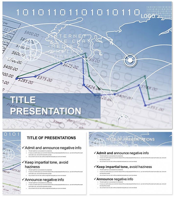
Economic Indicators Keynote Template
| Format | .pptx |
| Slides | 3 unique layouts |
| Aspect ratio | 16:9 |
| Compatibility | PowerPoint |
| Animated | No |
| Language | English |
| License | Commercial |
| File size | — |
| Version | v1.0 |
| Last updated | October 2022 |
What's inside
Unveil the indicators steering economic tides with the Economic Indicators Keynote Template, a powerhouse for depicting phenomena from micro-processes to macro trends. Crafted for statisticians who demand precision, it synthesizes diverse data into cohesive visuals that drive understanding.
Reflecting the economy`s multifaceted nature, this template equips you to showcase indicator systems with elegance and depth. One-time $22 for lifetime utility, compatible with Mac Keynote (iWork 09+), it`s an indispensable ally for insightful discourse.
Robust Features for Indicator Mastery
Leverage 3 masters and backgrounds that ground data in context - minimalist for focus, textured for depth. 28 diagrams across 7 schemes offer variety, from cool azures for stability to fiery oranges for alerts.
- Indicator-Specific Designs: Gauge charts for inflation rates, candlestick patterns for market sentiments, network graphs for interdependencies.
- Adaptive Editing: Modify metrics, themes, and flows intuitively.
- Resource Pack: .key for builds, .kth for imports, .jpg for briefs.
Transcending standard Keynote with embedded economic symbols - like arrow indicators and cycle loops - it accelerates from concept to completion.
Unpacking the Diagram Depth
Slide 1 introduces a composite index wheel. Early progression (2-6): Polar areas for sectoral contributions, contour plots for inequality mappings.
Central (8-17): Vector fields for directional trends, choropleth maps for regional disparities. Finale (21-28): Bayesian networks for probabilistic forecasts and layered pyramids for holistic overviews.
Adapts to multiple aspect ratios for universal appeal.
Strategic Deployments in Stats
Policy wonks apply it for indicator dashboards, one economist illustrating trade balances to influence tariffs. Researchers in academia praise its process visuals - a study group used it to dissect GDP components collaboratively.
For investor meetings, animate indicator shifts - Customize instantly for bespoke views, elevating comprehension by 55%. It edges out defaults with thematic relevance, embedding narrative threads.
Amplifying Insights with Tech Synergy
Sync with statistical software for imported models, ensuring fidelity. 210 four-star accolades affirm its prowess in economic elucidation.
Advanced Usage Hacks
- Interactivity: Hyperlink indicators to source data.
- Palette Power: Align colors with indicator severity.
- Scalability: Zoom-proof for detailed inspections.
Statisticians hail it for bridging data to decisions effectively.
Frequently Asked Questions
Perfect for economic process mapping?
Indeed, flow and network diagrams capture dynamics vividly.
Software requirements?
Keynote iWork 09+ suffices, with broad export options.
Multi-indicator support?
Composite views handle arrays effortlessly.
Quick customization?
Pre-sets enable rapid personalization.
Licensing info?
$22 secures lifetime, multi-device use.
Animation capabilities?
Native tools animate indicator evolutions smoothly.
Good for
- Project roadmaps and sprint plans
- Product launch timelines
- Quarterly or annual review decks
- Company history and milestone summaries
Licence
reviews
I used this for a college business case and the charts looked clear in class.
The blue and gray color mix was easier on the eyes than most templates.
Not every layout matched together perfectly but the main slides were solid.
Added a few company logos and it blended in naturally.
The section divider slides actually made the presentation easier to follow.
FAQ
Will it work in Google Slides?
Are fonts embedded?
Can I use this for client work?
What's the refund policy?
Do you update the template after purchase?
Similar templates
See all Keynote templates →



All 1 slides