 Click to zoom
Dynamic Cells Matrix PowerPoint Charts Template
| Format | .pptx |
| Slides | 15 unique layouts |
| Aspect ratio | 16:9 |
| Compatibility | PowerPoint |
| Animated | No |
| Language | English |
| License | Commercial |
| File size | — |
| Version | v1.0 |
| Last updated | August 2023 |
What's inside
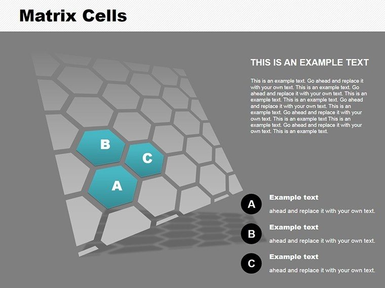
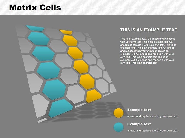
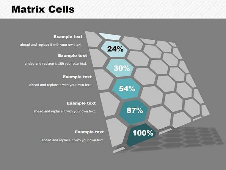
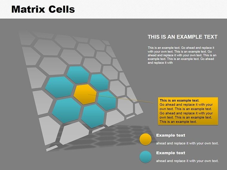
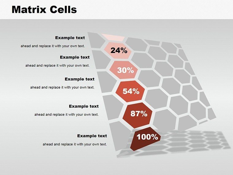
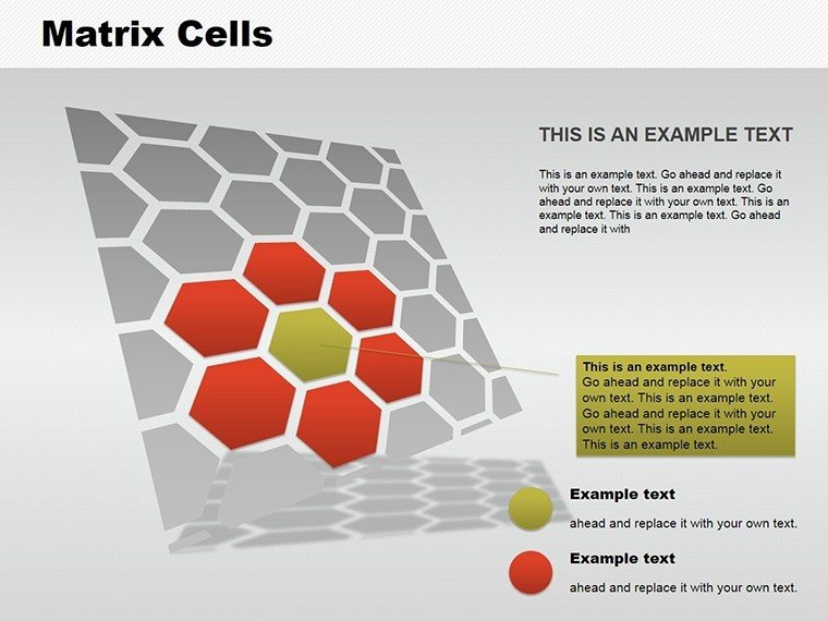
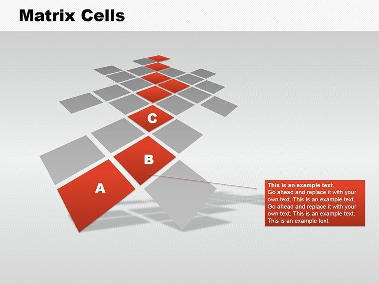
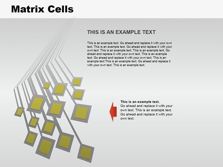
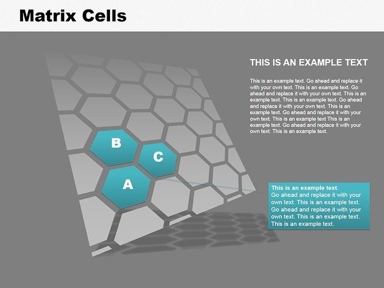
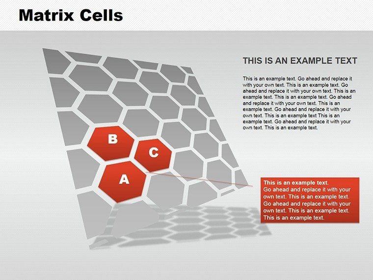
In today's fast-paced business and educational landscapes, conveying intricate data relationships effectively can make or break your message. Imagine transforming dense spreadsheets into visually compelling narratives that resonate with stakeholders, whether you're pitching a new architectural project or analyzing market trends. Our Cells Matrix PowerPoint Charts Template is designed precisely for this purpose, offering 15 fully editable slides that blend functionality with aesthetic appeal. Tailored for professionals like architects, business analysts, and educators, this template empowers you to illustrate comparisons, hierarchies, and interconnections with clarity and flair.
Picture an architectural firm preparing for an AIA award submission. Using a matrix chart, you can map out site analysis factors - such as environmental impact versus cost efficiency - in a grid that highlights trade-offs at a glance. This isn't just about data; it's about storytelling that drives decisions. With seamless compatibility across PowerPoint and Google Slides, you can customize colors to match your firm's branding, adjust fonts for readability, and rearrange layouts to fit your narrative flow. The result? Presentations that not only inform but inspire action, saving you hours of design time while elevating your professional image.
Key Features That Set This Template Apart
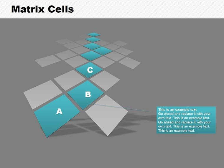
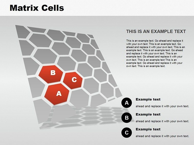
Diving deeper, the Cells Matrix template stands out with its intuitive design elements. Each slide features dynamic matrix grids that can be populated with your data effortlessly. For instance, the connected circles matrix allows you to show interdependencies in project phases, ideal for architectural planning where design, construction, and sustainability intersect. Unlike basic PowerPoint tools that limit you to static tables, our template includes pre-built animations that reveal data progressively, keeping your audience engaged without overwhelming them.
Customization is at the heart of this template. Select from a variety of layouts, including kite diagrams for hierarchical breakdowns or cycle matrices for ongoing processes like urban development cycles. Add engaging visuals such as themed icons - think blueprint symbols for architecture or gear icons for business operations - to make your points pop. This versatility ensures the template adapts to your needs, whether you're comparing building materials in an architecture pitch or evaluating competitive strategies in a business report.
Real-World Applications and Benefits
Let's explore how this template solves real pain points. In business, matrix charts are staples in consulting firms like McKinsey, where they use them for SWOT analyses or portfolio assessments. For example, a real estate developer might employ a matrix to compare property investments across criteria like location, ROI, and risk, drawing from case studies in urban planning. This approach not only clarifies complex decisions but also builds trust by demonstrating thorough analysis.
In education, teachers can use these matrices to break down historical events or scientific concepts, making abstract ideas tangible. An architecture professor might illustrate design principles by matrixing form versus function, helping students grasp AIA standards through visual aids. The benefits are clear: enhanced comprehension, reduced preparation time, and presentations that stand out in competitive environments. Compared to starting from scratch, this template accelerates your workflow, allowing focus on content rather than design.
Integrating this template into your routine is straightforward. Start by importing your data into the matrix cells - Excel compatibility makes this seamless. Then, tweak the visuals: adjust cell sizes for emphasis, incorporate color gradients to denote priority levels, and add notes for deeper insights. For an architectural presentation, include thumbnails of site plans within cells to create a multifaceted view. This not only enriches the content but aligns with best practices in data visualization, ensuring your audience retains key takeaways.
Step-by-Step Guide to Maximizing Your Matrix Charts
- Define Your Objective: Identify the relationships you want to highlight, such as cost-benefit in architecture projects.
- Populate the Matrix: Input data into the grid, using formulas if needed for dynamic updates.
- Customize Visuals: Choose colors and icons that resonate with your theme - blue tones for corporate, earth tones for architecture.
- Add Interactivity: Incorporate hyperlinks to detailed reports or animations for step-by-step reveals.
- Review and Refine: Test the presentation for flow, ensuring each matrix advances your story logically.
By following these steps, you'll create presentations that not only meet but exceed expectations. Take inspiration from real-world successes, like how matrix org charts clarify roles in matrix-structured firms, as seen in architectural practices adopting cross-functional teams for sustainable designs.
Why Choose Cells Matrix for Your Next Presentation?
This template isn't just a tool; it's a catalyst for better communication. In a world where attention spans are short, visually striking matrices cut through the noise, making your points memorable. For architects, it means turning blueprints into persuasive stories that win clients. For business leaders, it's about data-driven decisions that propel growth. With wide applicability across industries, from healthcare process mapping to educational curricula, the value is undeniable.
Enhance your toolkit with tips like using LSI terms naturally - think "data grid visualization" or "comparative analysis charts" - to boost search visibility without compromising readability. And remember, trustworthiness comes from expertise: our designs draw from proven methodologies, ensuring compliance with standards like those from the American Institute of Architects for visual representations.
Elevate your presentations today with the Cells Matrix PowerPoint Charts Template. Customize, captivate, and conquer your audience - download now and see the difference!
FAQ
How editable are the matrix charts?Fully editable! You can modify every element, from colors and fonts to layouts and data inputs, ensuring it fits your specific needs.Is this template compatible with Google Slides?Yes, it works seamlessly with both PowerPoint and Google Slides for flexible use across platforms.Can I use it for architectural presentations?Absolutely - it's ideal for mapping project variables like site factors or material comparisons in architecture.What if I need more slides?The template includes 15 slides, but you can duplicate and customize them easily to expand as needed.Are there animation options?Yes, built-in animations help reveal data progressively, enhancing engagement in your talks.Good for
- Project roadmaps and sprint plans
- Product launch timelines
- Quarterly or annual review decks
- Company history and milestone summaries
Licence
reviews
Worked fine for my marketing assignment last week.
The charts were easy to understand and edit.
I’m not a designer so simple templates like this help.
One graph style looked too busy for my taste.
FAQ
Will it work in Google Slides?
Are fonts embedded?
Can I use this for client work?
What's the refund policy?
Do you update the template after purchase?
Similar templates
See all PowerPoint Charts →

All 15 slides