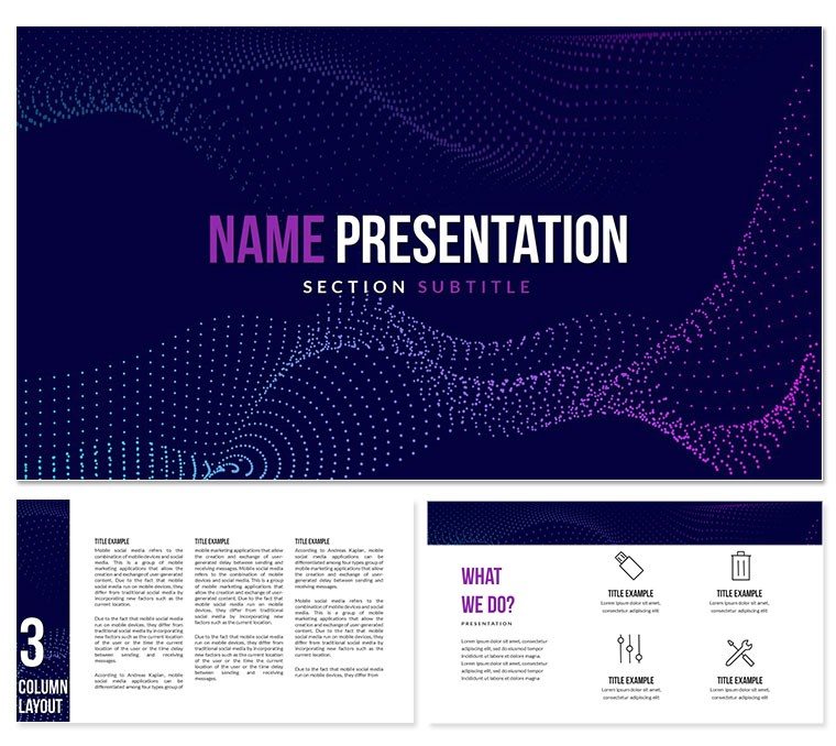
 Click to zoom
Download Light Breeze Keynote Template
| Format | .pptx |
| Slides | 3 unique layouts |
| Aspect ratio | 16:9 |
| Compatibility | PowerPoint |
| Animated | No |
| Language | English |
| License | Commercial |
| File size | — |
| Version | v1.0 |
| Last updated | December 2024 |
What's inside
Download the Light Breeze Keynote Template, a professional and adaptable design solution that will make your ideas sparkle.
Why Choose the Light Breeze Keynote Template?
This template blends modern aesthetics with utility, providing a clean and simple design suitable for a variety of uses, including corporate meetings, educational lectures, and creative presentations. Its soothing color palette and straightforward structure create a clean and peaceful visual experience.
Key features:
- Professionally Designed Slides: More than 30 completely customizable slides adapted to specific presentation requirements.
- Elegant visuals: Subtle gradients and contemporary typeface improve readability and beauty.
- Drag-and-Drop Editing: Easily add photos, charts, and text to create a personalized appearance.
- Versatile application: ideal for business, education, startups, and the creative sectors.
- Compatibility: Designed specifically for Apple Keynote, assuring seamless operation and superior quality.
Why It's Ideal for Your Next Presentation.
The Light Breeze Keynote Template is more than a design; it's a tool for improving your storytelling. Its calming tones and balanced layout give off a professional yet friendly atmosphere, making a lasting impression on your audience.
Don't settle with mediocre slides when you can wow with each click. Download the Light Breeze Keynote Template today to easily improve your presenting skills. Make your ideas unforgettable by downloading the Light Breeze Keynote Template today!
Good for
- Project roadmaps and sprint plans
- Product launch timelines
- Quarterly or annual review decks
- Company history and milestone summaries
Licence
reviews
I’m usually lazy with presentation design but this made it quicker
The charts were readable even when I added too much data
One or two slides had weird spacing on my screen though
Worked fine for a monthly office recap presentation
I mostly used the darker layouts because they looked cleaner
FAQ
Will it work in Google Slides?
Are fonts embedded?
Can I use this for client work?
What's the refund policy?
Do you update the template after purchase?
Similar templates
See all Keynote templates →


All 1 slides