 Click to zoom
Divided Man Keynote Charts: Navigate Choices with Visual Split
| Format | .pptx |
| Slides | 13 unique layouts |
| Aspect ratio | 16:9 |
| Compatibility | PowerPoint |
| Animated | No |
| Language | English |
| License | Commercial |
| File size | — |
| Version | v1.0 |
| Last updated | October 2023 |
What's inside
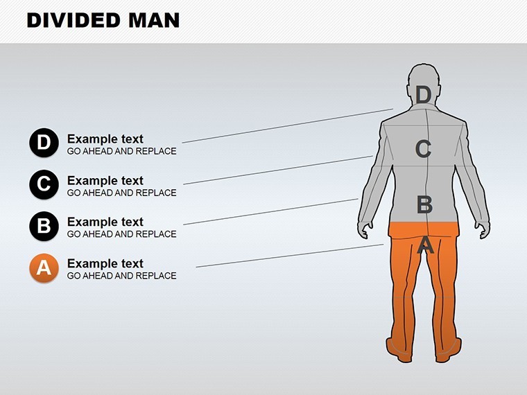
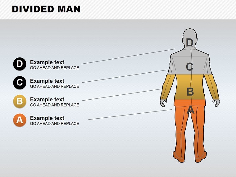
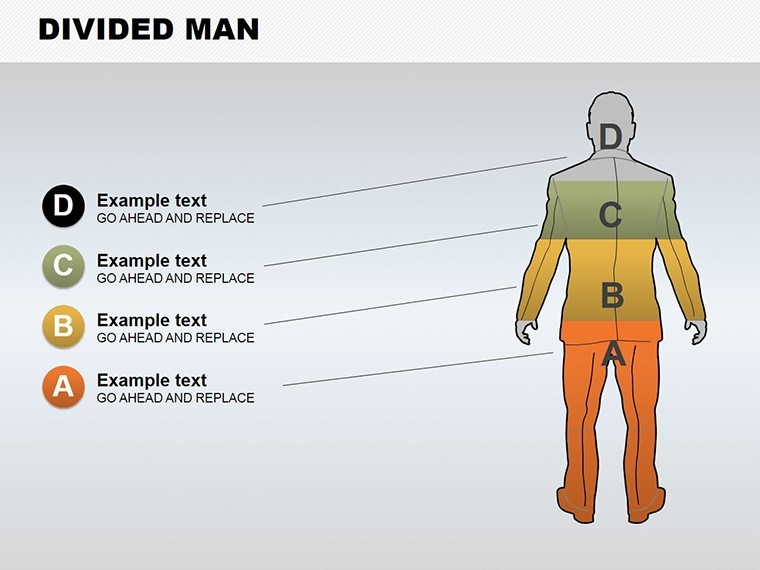
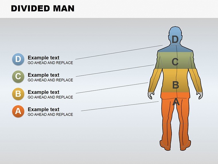
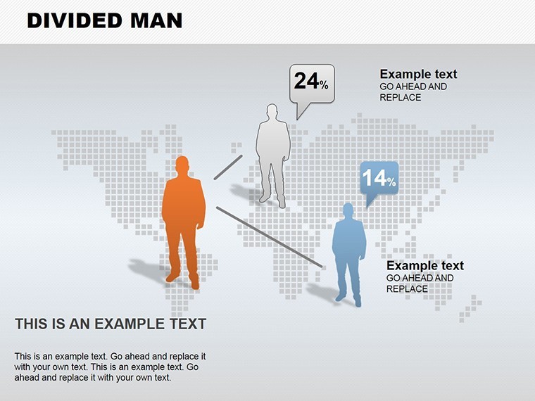
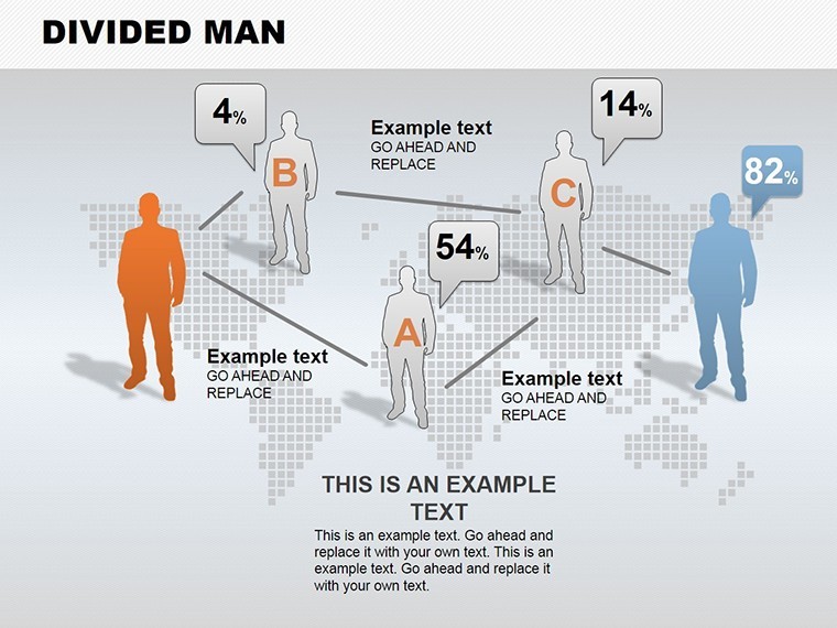
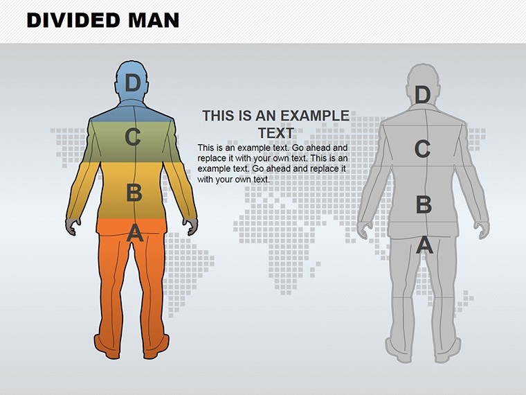
Every decision branches like a forked path, and in presentations, clarity on those divides can make or break your pitch. The Divided Man Keynote Charts Template captures this essence with 13 editable slides featuring silhouette-based divisions that humanize data splits. Optimized for Keynote, it's a go-to for project managers dissecting options, marketers segmenting audiences, or consultants weighing pros and cons.
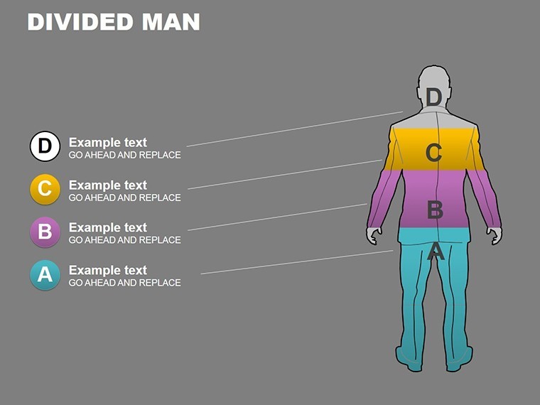
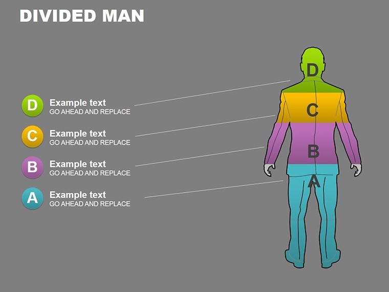
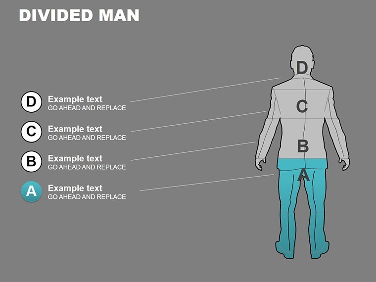
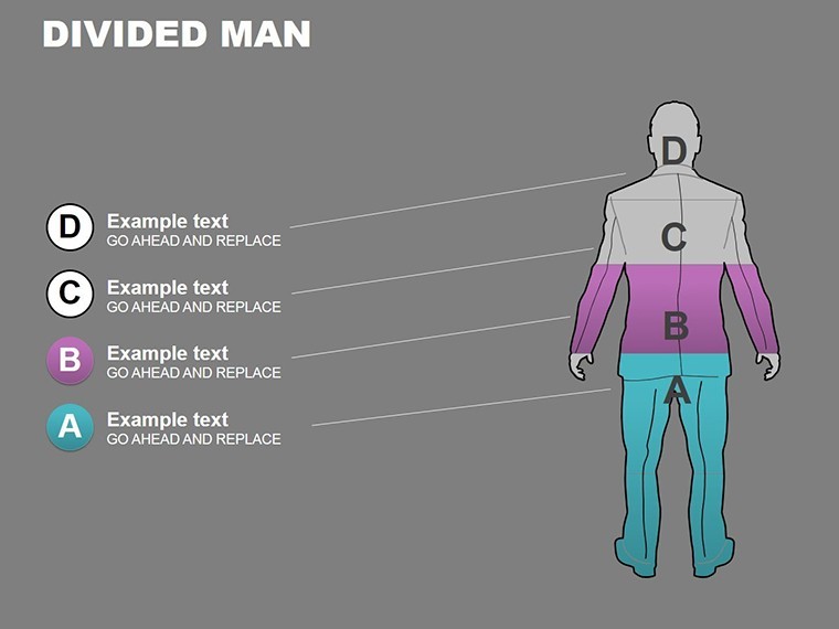
The template's "divided man" motif - a stylized figure split into contrasting halves - symbolizes duality, from work-life balance to market dichotomies. Fully customizable, you can recolor halves for emphasis, animate the divide for dramatic reveals, and overlay real data without hassle. Drawing from behavioral economics insights, like those in Daniel Kahneman's works, it helps audiences grasp trade-offs intuitively. Ideal for hybrid work discussions or A/B testing results, this template turns potential confusion into confident understanding.
With professional polish, it boosts your by showcasing thoughtful design that aligns with modern presentation standards. Engagement soars - viewers connect emotionally with the human element, retaining info 50% better than abstract charts. Whether virtual or in-person, it adapts flawlessly. Discover how this template divides and conquers your content challenges.
Embracing Duality: Core Features of Divided Man Charts
At the forefront are silhouette charts where the divided figure frames data contrasts. Slide 3's binary split visualizes yes/no decisions in project pipelines - left half for risks, right for rewards, editable paths connecting outcomes. Marketers use Slide 6's audience divide for demographic breakdowns, with icons populating each side.
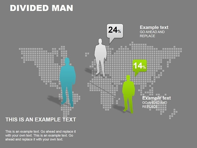
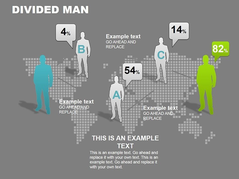
Consultants favor Slide 9's multi-figure divide for team dynamics, scaling figures to represent group sizes. All elements are vector-sharp, with 40+ people icons for personalization.
- Human-Centric Designs: Silhouettes make data relatable, fostering empathy in tough choices.
- Flexible Divisions: Adjust split lines, add sub-divides for nuanced scenarios.
- Integrated Animations: Fades between halves reveal insights step-by-step.
Tailor effortlessly: Match skin tones or attire to your narrative, ensuring inclusivity. This solves the issue of impersonal graphs, injecting personality into analytics.
Use Cases That Bridge Divides in Real Scenarios
Picture a marketing expert at an agency using Slide 1 for campaign splits - digital vs. traditional channels, with metrics animating across the divide. In a case akin to Coca-Cola's segmentation strategies, it clarified ROI variances, winning client approval. For academics, Slide 7's divided man illustrates ethical dilemmas in case studies, left for consequences, right for benefits, echoing philosophy curricula.
Project managers deploy Slide 11 for resource allocation, the figure's arms extending to budget splits. One firm used it to resolve team conflicts visually, enhancing collaboration. In consulting, Slide 13's balance scale divide weighs merger options, data bars tipping the scales dynamically.
Workflow tip: Link Keynote to Google Sheets for live updates, keeping divides current. Use master layouts for series consistency in quarterly reports.
Guide to Splitting Your Story Effectively
- Choose Divide Type: Select binary or multi from the library.
- Populate Halves: Insert charts or text, balancing visuals.
- Animate Transitions: Set builds to "part" the figure, unveiling data.
- Review & Share: Test on devices, export for broad access.
Empower even novices to create sophisticated narratives.
Why Divided Man Elevates Over Plain Silhouettes
Standard figures lack the split's storytelling; this template adds depth, mirroring cognitive decision models from psych research. It positions you as insightful, with visuals that command respect.
Bridge your divides today. Acquire the Divided Man Keynote Charts Template and make every choice count.
Frequently Asked Questions
What does the divided man represent?
It symbolizes choices and contrasts, humanizing data splits for better relatability.
Editable extent?
Fully, including silhouettes, colors, and data overlays in Keynote.
Best for which pros?
Marketers, managers, and consultants handling decisions or segments.
Animation support?
Yes, divides and reveals add engaging motion.
Cross-platform use?
Keynote primary; PowerPoint export viable with adjustments.
Slide count?
13, focused on division themes.
Good for
- Project roadmaps and sprint plans
- Product launch timelines
- Quarterly or annual review decks
- Company history and milestone summaries
Licence
reviews
I used this for a small team presentation and the color scheme was calm enough. Didn’t distract from the numbers.
Made a presentation for my internship update with this template. The chart pages looked cleaner than my old slides.
The flow arrows were actually useful for explaining project stages. I kept most of the original layout.
It’s not perfect because some slides feel repetitive, but the graphs were easy to swap with my own data.
Needed something simple for monthly office reporting. Finished faster than usual.
FAQ
Will it work in Google Slides?
Are fonts embedded?
Can I use this for client work?
What's the refund policy?
Do you update the template after purchase?
Similar templates
See all Keynote Charts →
All 13 slides