 Click to zoom
Data Visualization Keynote Charts Template: Illuminate Your Insights
| Format | .pptx |
| Slides | 59 unique layouts |
| Aspect ratio | 16:9 |
| Compatibility | PowerPoint |
| Animated | No |
| Language | English |
| License | Commercial |
| File size | — |
| Version | v1.0 |
| Last updated | February 2024 |
What's inside
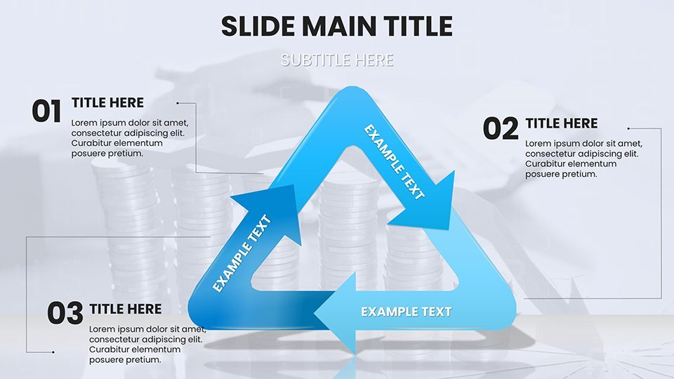
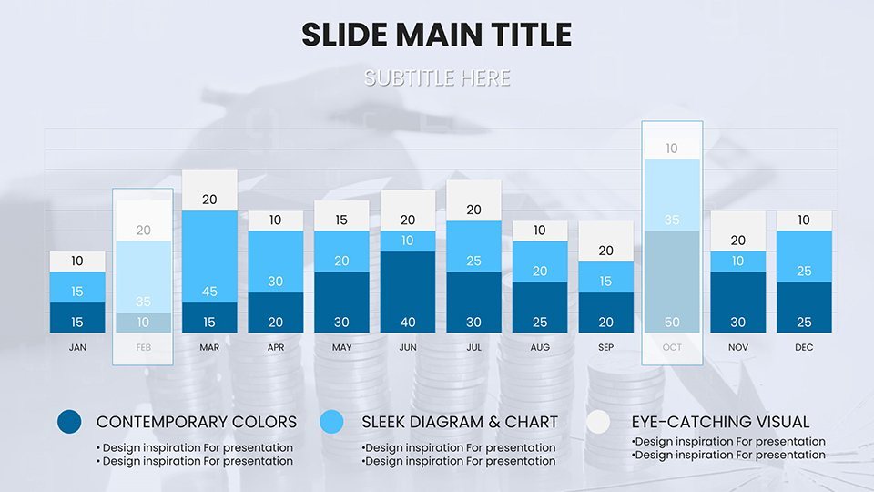
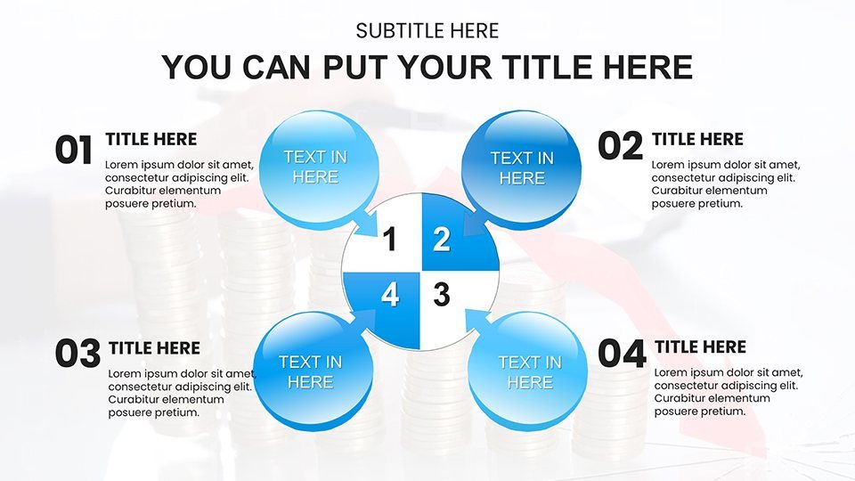
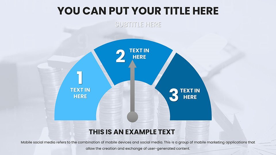
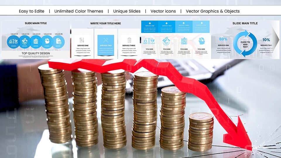
In an era where data drives decisions, presenting information effectively is key to success. Our Data Visualization Keynote Charts Template empowers you to turn raw numbers into narrative gold, whether you're a business analyst forecasting trends or a teacher illustrating scientific concepts. With 59 editable slides featuring a diverse array of charts and graphs, this template is your go-to for Apple Keynote, offering professional designs that simplify complexity without sacrificing depth. From bar charts comparing sales quarters to heat maps revealing patterns, it's built to make your data speak volumes.
Envision leading a board meeting where your slides, inspired by visualization pioneers like Stephen Few, use clean lines and strategic colors to highlight key metrics, adhering to principles of perceptual accuracy. This template isn't generic - it's optimized for clarity, helping you avoid common pitfalls like overcrowded visuals. Users appreciate its ease, allowing quick customizations that align with brand guidelines, ultimately fostering better understanding and faster action from your audience.
Core Components: Features That Bring Data to Life
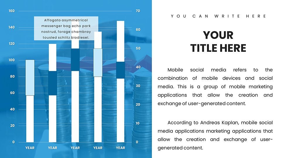
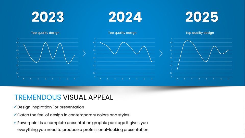
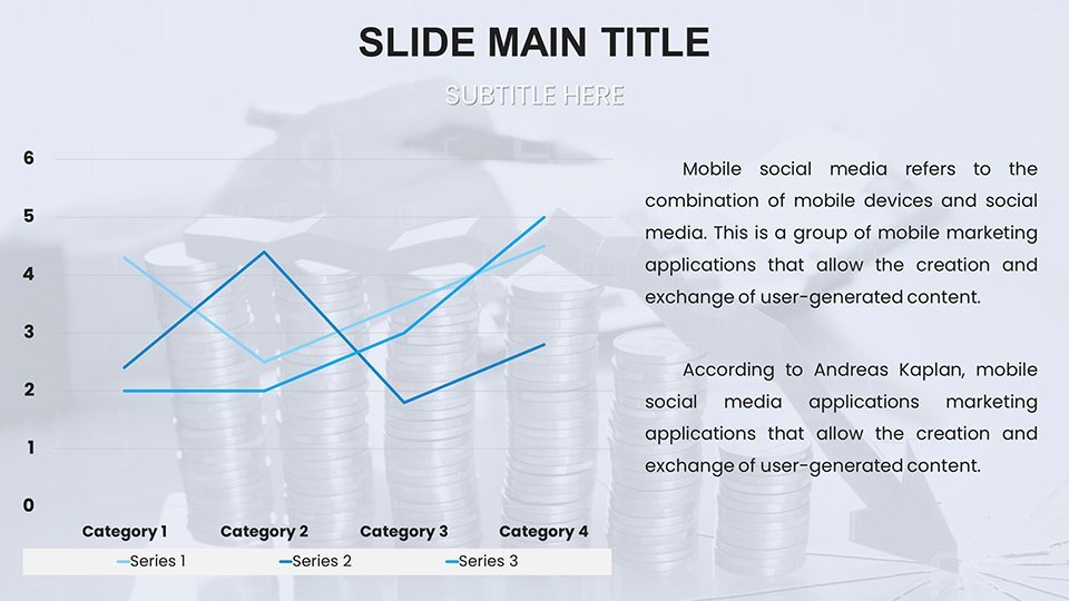
The template's arsenal includes versatile chart types: line graphs for trend analysis, pie charts for proportion breakdowns, and scatter plots for correlation spotting. Each is fully editable, with data entry via Keynote's chart editor for real-time updates. The professional aesthetic features minimalist palettes, ensuring focus on the data rather than distractions.
Additional elements like legends, axes labels, and tooltips are pre-configured for accessibility, while gridlines aid precision. With full HD resolution, slides shine in presentations or reports. The 59-slide variety covers intros, data sections, and conclusions, providing a complete structure that streamlines your workflow.
Practical Scenarios: Tailored Use Cases Across Fields
For business pros, deploy area charts to show market share evolution, akin to how companies like Google visualize user growth. Educators can use box plots in statistics lessons to demonstrate distributions, enhancing student comprehension. Students crafting theses might employ waterfall charts for financial breakdowns, making arguments more persuasive.
In healthcare, treemaps could illustrate resource allocation, while in marketing, funnel charts track conversion rates. The template's adaptability shines in agile environments, where quick iterations on dashboards lead to informed pivots, as seen in case studies from firms like McKinsey on data-driven strategies.
Effortless Editing: Guidance for Optimal Customization
Begin by importing your dataset - copy from spreadsheets and paste into charts for instant visualization. Adjust scales via the inspector to fit your range, and experiment with 3D effects for emphasis. Tip: Follow Tufte's data-ink ratio by minimizing non-essential elements, a practice this template supports natively.
Compared to Keynote's basics, our version offers pre-tuned templates that prevent aesthetic mismatches, saving design time. For collaborative work, share via iCloud and edit in real-time, ensuring team alignment. In reports, export to PDF for print-ready versions that maintain fidelity.
Amplifying Clarity: Advanced Techniques and Integrations
Enhance with annotations for key insights or hyperlinks to source data, building trust. Use animations to reveal data progressively, avoiding overload. Real users in finance have leveraged combo charts for overlaying metrics, leading to sharper analyses. The template integrates with tools like Numbers for complex calculations, expanding its utility.
By prioritizing user-centric design, it addresses pain points like misinterpretation, fostering environments where data informs rather than confuses. Over 100 ratings confirm its effectiveness in diverse settings.
Superior Edge: Beyond Basic Visualization Tools
Unlike free-for-all options, this template provides structured excellence, ensuring professional outputs. It's the difference between a scattershot approach and targeted impact, ideal for those serious about data storytelling.
Act Now: Download and Visualize Success
Transform your data today - download this essential template and start crafting visuals that drive results. Your next breakthrough awaits; seize it with confidence.
Frequently Asked Questions
What chart types are included in this template?
A variety including line, bar, pie, scatter, and more, all fully editable for diverse data needs.
Is it easy to customize for beginners?
Yes, with intuitive Keynote tools and pre-set designs, no advanced skills required.
Can I use this for educational purposes?
Definitely, perfect for teachers and students to illustrate concepts clearly.
Does it support data import from other apps?
Absolutely, paste from Excel or Numbers for seamless integration.
Are updates available?
Yes, free updates ensure ongoing improvements.
Good for
- Project roadmaps and sprint plans
- Product launch timelines
- Quarterly or annual review decks
- Company history and milestone summaries
Licence
reviews
Pulled this for an environmental consulting gig and the area graphs for emissions were solid.
The tree and solar panel icons scaled well but some fonts were off.
A bit busy on some slides but the overall structure is logical.
The comparison slides for policy effects helped me make a clear argument to stakeholders.
Not the most amazing template but for $18 it saved me a few hours.
FAQ
Will it work in Google Slides?
Are fonts embedded?
Can I use this for client work?
What's the refund policy?
Do you update the template after purchase?
Similar templates
See all Keynote Charts →
All 59 slides