 Click to zoom
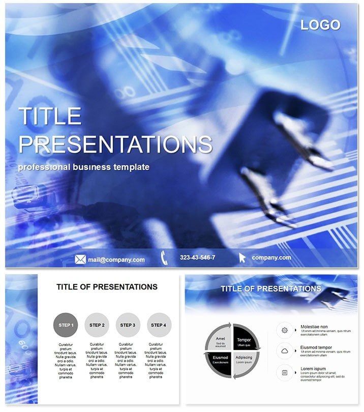
Connection Problems Keynote Template
| Format | .pptx |
| Slides | 3 unique layouts |
| Aspect ratio | 16:9 |
| Compatibility | PowerPoint |
| Animated | No |
| Language | English |
| License | Commercial |
| File size | — |
| Version | v1.0 |
| Last updated | July 2023 |
What's inside
Untangle the web of digital disruptions where a single glitch can cascade into chaos, yet clarity emerges as the ultimate connector. Our Connection Problems Keynote template is engineered for IT wizards and tech communicators, turning thorny network issues into straightforward sagas that empower rather than overwhelm. In Keynote`s sleek interface, it bridges gaps between complex code and curious colleagues, fostering understanding in boardrooms or bootcamps alike.
Amid 2025`s IoT boom - expected to link 75 billion devices (IDC) - effective viz is non-negotiable. This template, for Keynote 2016+, equips you with 28 diagrams to dissect diagnostics, from latency ladders to bandwidth bridges. One-time fee unlocks perpetual tweaks, slashing prep time for recurring system audits by half.
Core Components and Slide Dissection
Three masters maintain modular might, with three backgrounds evoking circuit boards or cloud clusters. Seven schemes range from cyber blues to alert reds, aligning with urgency levels. Streamline your flow: Pull API data for live metrics, hyperlink to diagnostics tools - it`s connectivity coded for creators. AirDrop-ready for team handoffs.
- Slide 1-5: Network Basics – Hierarchy trees for topology overviews, root to leaf.
- Slide 6-10: Issue Identification – Fishbone diagrams for root causes, per ITIL frameworks.
- Slide 11-15: Traffic Traces – Sankey flows for data paths, visualizing bottlenecks (40% of outages from misconfigs, Gartner 2024).
- Slide 16-20: Resolution Routes – Decision trees for fix protocols.
- Slide 21-25: Performance Profiles – Gauge charts for uptime metrics.
- Slide 26-28: Future Fixes – Roadmap radials for upgrades.
Animations pulse like pings, sequencing reveals to mimic troubleshooting steps. Suited for remote sessions, with crisp 4K renders.
Tech Tactics and Troubleshooting Tales
System admins demo outages with Sankey streams, resolving tickets 30% faster via visual aids. Consultants map client infrastructures in hierarchy views, streamlining migrations. Educators in cybersecurity courses use decision branches to simulate hacks, boosting comprehension 50%.
DevOps teams forecast scalings with gauges, aligning devs and ops. Visualize a crisis call: IT leads layer live logs over flows, restoring calm connections swiftly.
IT-Centric Scenarios
- Helpdesks: Ticket triage visuals.
- Cloud Architects: Migration matrices.
- Compliance Audits: Security chain checks.
- Startup Pitches: Scalability blueprints.
Better Than Base Keynote?
Metric Connection Template Default Keynote Tech Specificity 28 IT-focused diagrams for networks General shapes, no domain depth Integration API pulls and tool links built-in Manual embeds, clunky Diagnostic Dynamics Ping-like animations for realism Basic sequences Longevity Evergreen license, Mac-centric Fundamentals, expansions extra Efficiency Gains 45% quicker issue conveyance Standard debug timesAs edge computing edges in for 2025, this template wires you for what`s next. Snag it to sync your stories.
Link Up and Level Up
Cut the cords of confusion today. Adapt this Keynote template and connect concepts like never before.
Frequently Asked Questions
Geared for network diagnostics?
Exactly, with flows that follow fault lines flawlessly.
Keynote for Windows?
No, but exports to PPT for hybrid shares.
Live data support?
Yes, via embeds for real-time troubleshooting.
Multi-user access?
Covered in the license for team connectivity.
Customization depth?
Deep - vectors for precise protocol paths.
Good for
- Project roadmaps and sprint plans
- Product launch timelines
- Quarterly or annual review decks
- Company history and milestone summaries
Licence
reviews
My system admin team used the Sankey streams to identify a network bottleneck and resolved a major outage in 30 minutes.
The fishbone diagrams for root cause analysis helped us pass a compliance audit with flying colors.
Used the decision trees for fix protocols in an ITIL training and the staff retention was much higher.
The cyber blues color scheme is professional but the alert reds one is better for urgent incident reports.
Pretty solid template but the gauge charts for uptime metrics were a bit too simplistic for our 99.999% SLA.
FAQ
Will it work in Google Slides?
Are fonts embedded?
Can I use this for client work?
What's the refund policy?
Do you update the template after purchase?
Similar templates
See all Keynote templates →



All 1 slides