 Click to zoom
Column Line Charts Keynote Template: Dynamic Visuals
| Format | .pptx |
| Slides | 14 unique layouts |
| Aspect ratio | 16:9 |
| Compatibility | PowerPoint |
| Animated | No |
| Language | English |
| License | Commercial |
| File size | — |
| Version | v1.0 |
| Last updated | January 2024 |
What's inside
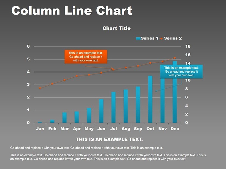
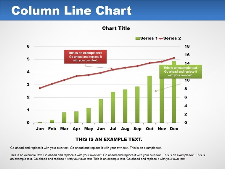
Picture this: You're in a high-stakes boardroom, unveiling financial trends that could shape your company's future. Instead of dense spreadsheets, your slides feature elegant column and line charts that weave data into a compelling narrative. Our Column Line Charts template for Keynote brings this vision to life with 14 meticulously designed, editable slides. Aimed at business analysts, educators, and marketers, it combines the solidity of column charts for categorical data with the fluidity of lines for trends, creating visuals that resonate and inform.
This template isn't just about charts; it's about storytelling through data. With a curated color palette that enhances readability, you can highlight key insights without overwhelming your audience. Whether tracking sales growth or illustrating project timelines, these slides adapt to your content, ensuring every presentation leaves a mark. Embrace a tool that turns complex information into accessible, engaging visuals, boosting your confidence and effectiveness as a presenter.
Essential Features That Set It Apart
At the core of this template is visual versatility. The 14 slides offer a mix of standalone column charts, pure line graphs, and hybrid designs that overlay lines on columns for multifaceted analysis. Customization is effortless - tweak hues to match your branding, resize elements for emphasis, and add animations for smooth reveals. Categorized under graphs and analysis, it's built for precision in data representation.
In-Depth Slide Exploration
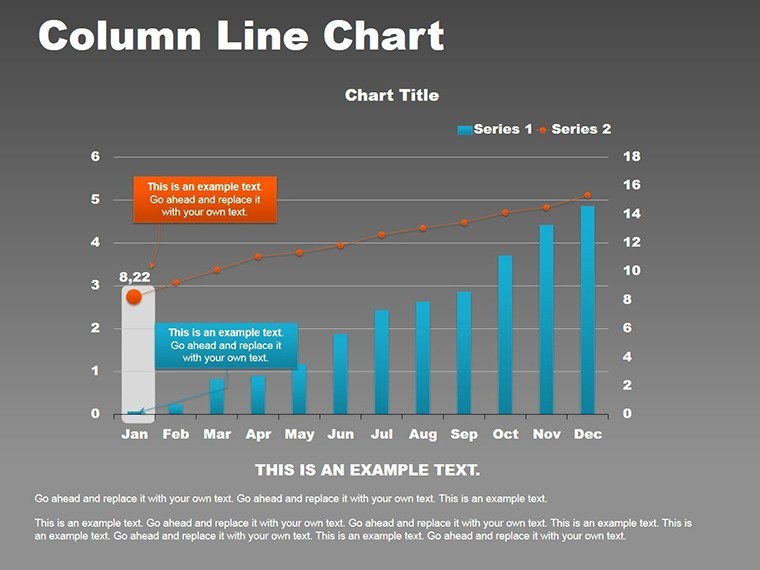
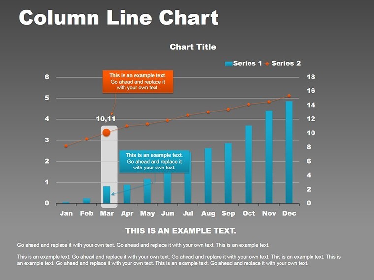
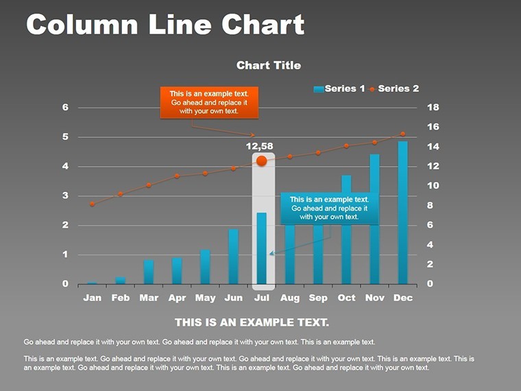
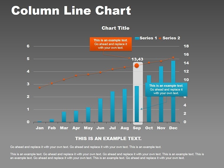
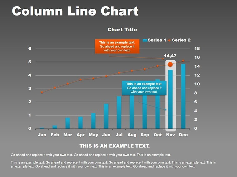
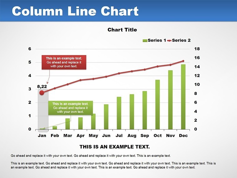
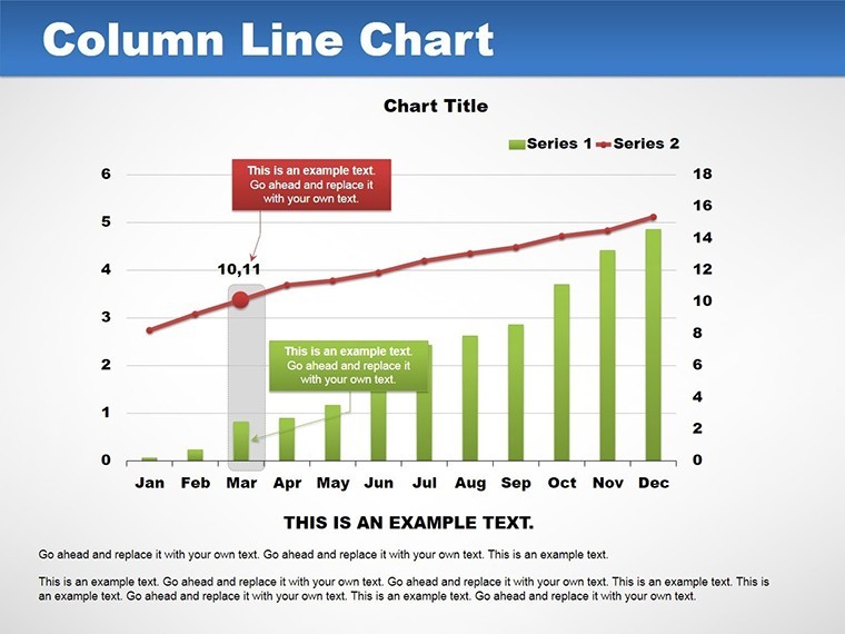
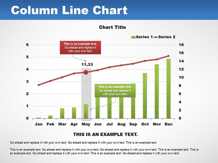
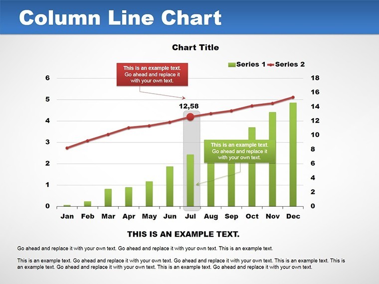
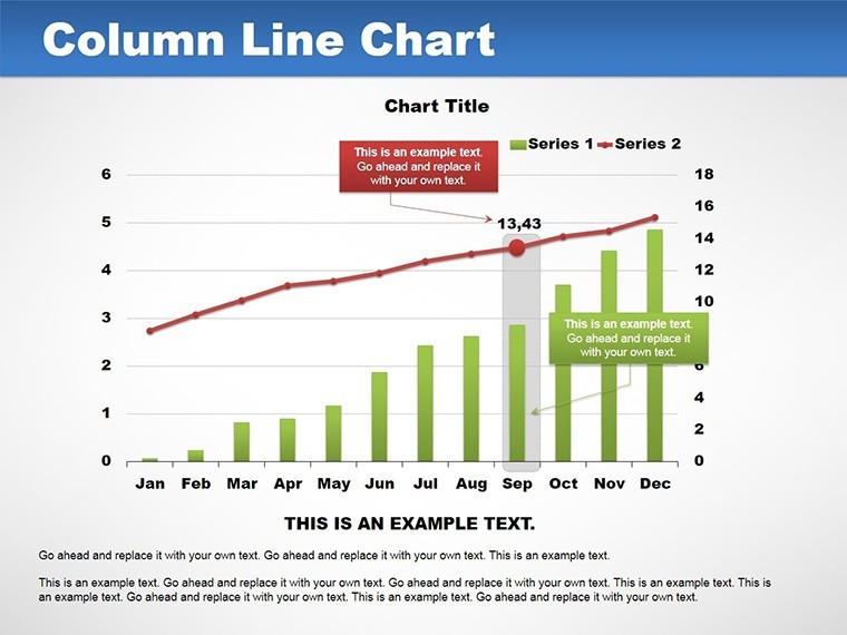
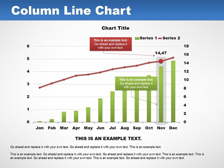
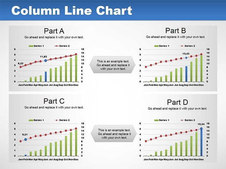
Slide 1 kicks off with a basic column chart for introductory data sets, like quarterly revenues. Slides 2-5 build on this with line integrations, showing trends over time, such as stock price fluctuations alongside volume bars. Slide 6 introduces dual-axis charts, perfect for comparing disparate metrics like temperature and sales in a retail context.
Slides 7-10 focus on advanced applications: multi-series lines on stacked columns for market share breakdowns, with tooltips for deeper insights. Slide 11 offers a timeline hybrid, merging project phases (columns) with progress curves (lines). The final slides, 12-14, provide summary views with customizable legends and annotations, allowing you to call out anomalies or achievements.
Each slide employs a clean, intuitive layout that prioritizes data integrity, drawing from design principles used in tools like Tableau for professional-grade outputs.
Practical Use Cases and Value Propositions
For financial professionals, envision using these charts in annual reports: Columns depict budget allocations, while lines trace expenditure trends, revealing efficiencies at a glance. Educators might apply them in lessons on economics, plotting GDP growth (lines) against employment rates (columns) to illustrate correlations vividly.
Analysts in tech could map user engagement: Columns for daily logins, lines for retention rates, highlighting drop-off points for strategic interventions. The benefits are manifold - faster audience comprehension, reduced misinterpretation, and heightened engagement. Unlike rudimentary Keynote charts, this template offers pre-optimized scales and grids, saving design time and elevating polish.
Pro Tips for Maximum Impact
Start by selecting colors that convey emotion - blues for stability in financial data, greens for growth in projects. Limit data series to avoid clutter; three to five is ideal for clarity. Integrate Keynote's shape tools to add callouts, emphasizing peaks or troughs. Always test on different devices to ensure legibility.
Compared to free alternatives, this paid template provides thematic consistency and advanced layering, akin to those in Harvard Business Review visuals, underscoring your analytical prowess and trustworthiness.
Integrating Into Your Workflow
Seamlessly import data from Excel, then refine in Keynote for a polished finish. This template supports iterative updates, making it ideal for ongoing reports. Users in diverse fields report stronger stakeholder buy-in, as dynamic visuals foster better discussions and decisions.
Don't settle for static data - unlock dynamic storytelling now with this template and transform how you present insights.
Frequently Asked Questions
What makes the column and line integration unique?
It allows simultaneous display of categories and trends, providing deeper insights in one view.
Is the color palette fully customizable?
Yes, adjust schemes to fit your brand or narrative needs easily within Keynote.
Can this be used for educational purposes?
Certainly, it's great for teaching data interpretation with engaging visuals.
How do I add animations to the charts?
Use Keynote's built-in tools to animate elements sequentially for emphasis.
What if my data changes frequently?
The editable slides support quick updates without redesigning from scratch.
Good for
- Project roadmaps and sprint plans
- Product launch timelines
- Quarterly or annual review decks
- Company history and milestone summaries
Licence
reviews
Needed something clean for quarterly analytics and this worked.
Some chart colors felt repetitive though.
The slide layouts stayed organized even with lots of data.
I mostly used the line graph pages.
FAQ
Will it work in Google Slides?
Are fonts embedded?
Can I use this for client work?
What's the refund policy?
Do you update the template after purchase?
Similar templates
See all Keynote Charts →
All 14 slides