 Click to zoom
Collection Pie Chart Templates for Keynote Professionals
| Format | .pptx |
| Slides | 24 unique layouts |
| Aspect ratio | 16:9 |
| Compatibility | PowerPoint |
| Animated | No |
| Language | English |
| License | Commercial |
| File size | — |
| Version | v1.0 |
| Last updated | October 2022 |
What's inside
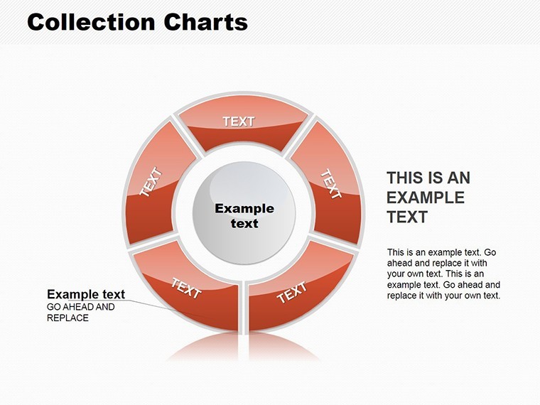
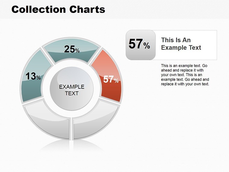
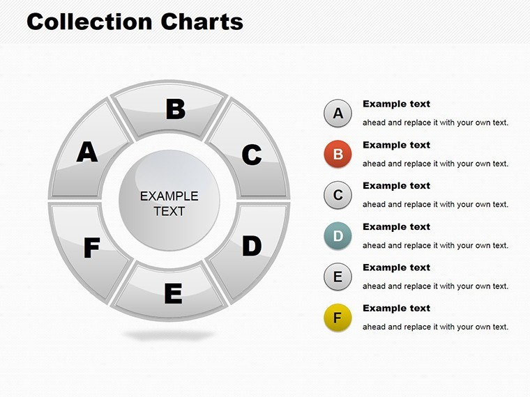
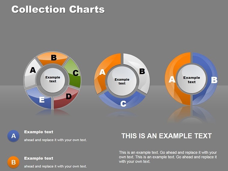
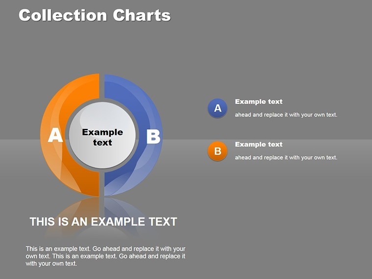
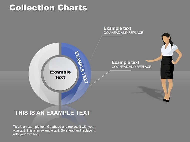
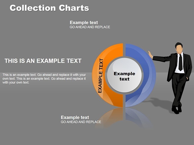
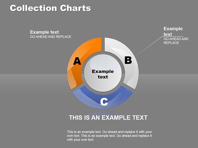
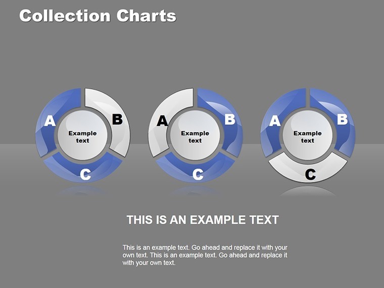
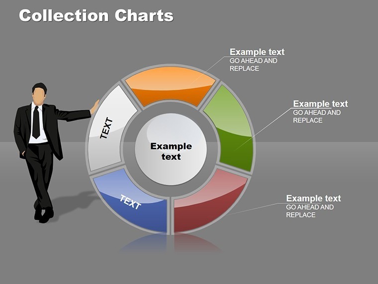
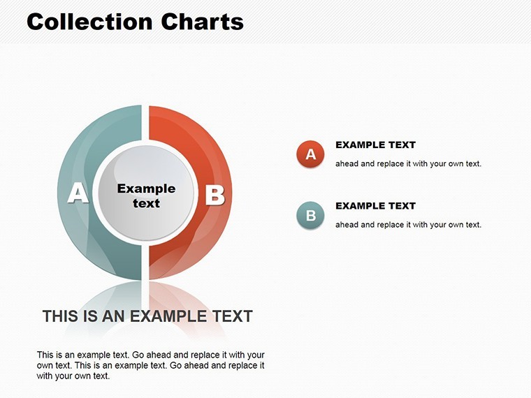
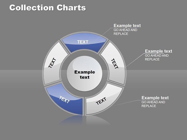
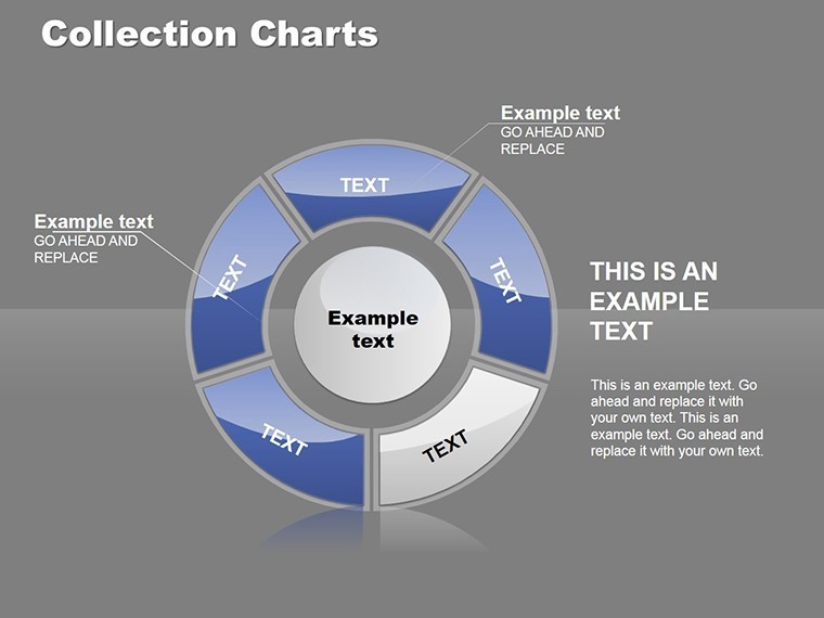
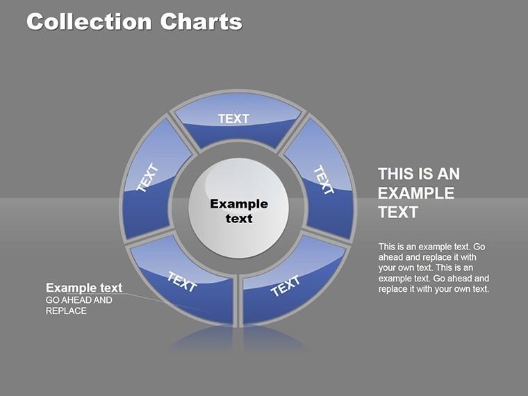
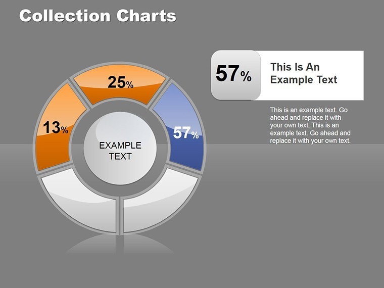
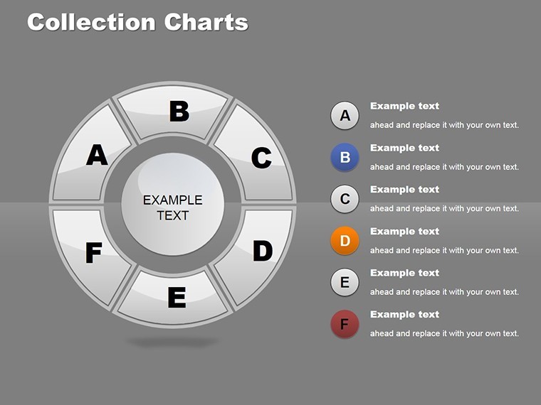
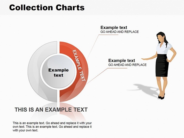
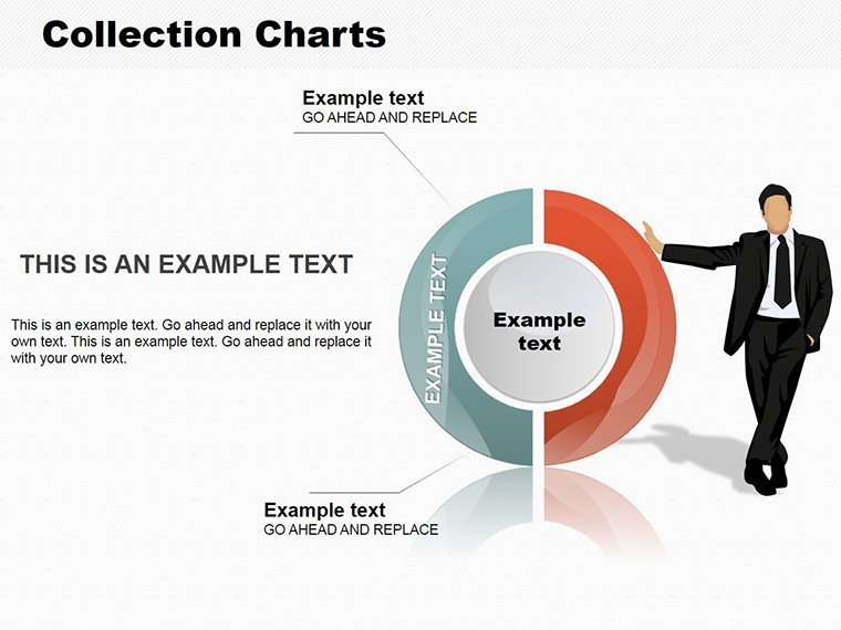
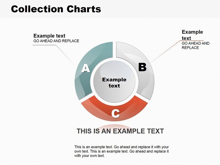
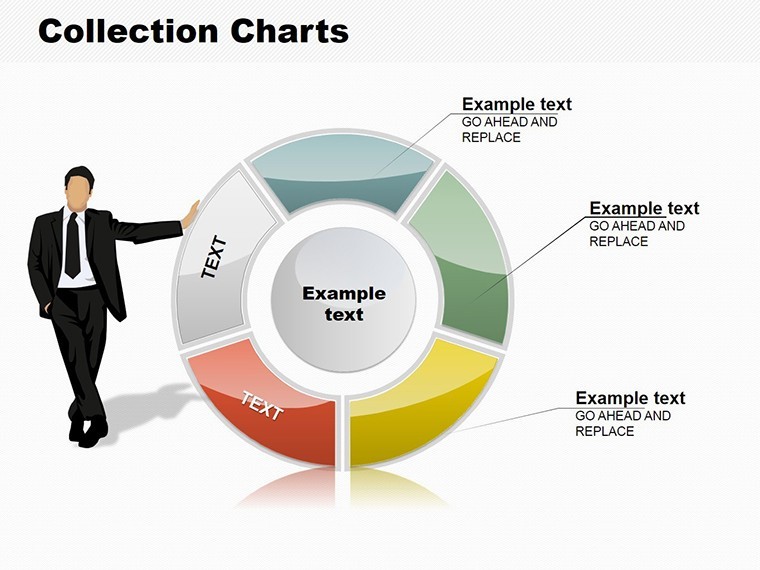
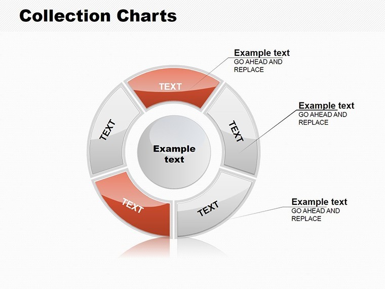
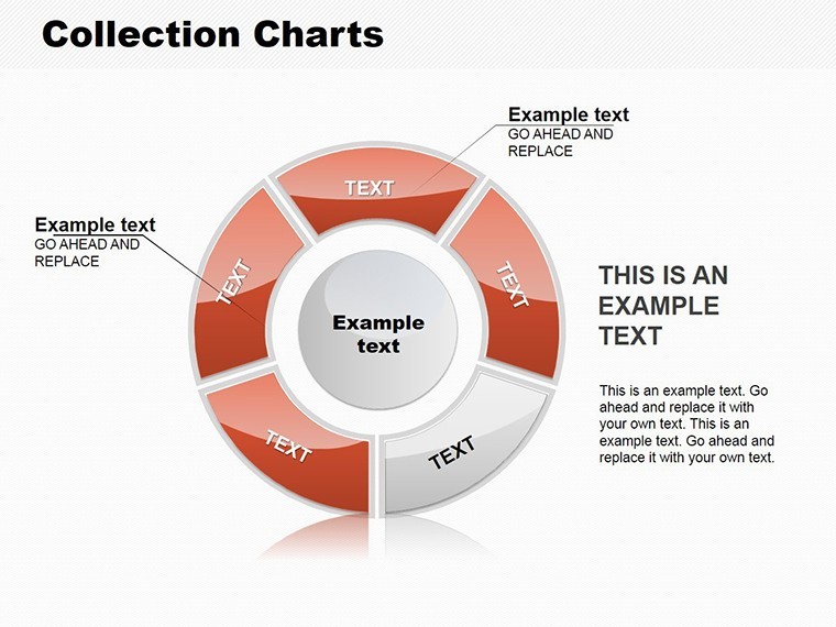
When it comes to presenting proportional data, nothing beats the simplicity and effectiveness of a well-designed pie chart. Our Collection Pie Chart Templates for Keynote bring together a diverse set of unique designs, each featuring sectors that can be effortlessly customized to highlight specific insights. With 24 editable slides, this template is tailored for business leaders, analysts, and educators who want to turn numbers into narratives that stick.
Picture this: You're in a boardroom, explaining market share distribution. Instead of dry spreadsheets, you reveal a vibrant pie chart where each slice tells a story - perhaps one sector pulsing with your company's growth metrics. Rooted in data visualization principles from pioneers like Florence Nightingale, who used pie charts for health stats, our templates ensure your data speaks volumes without words.
Standout Features of Our Pie Chart Collection
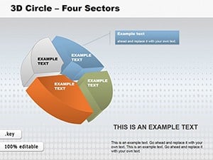
The core strength lies in versatility. Change colors to denote categories, like red for risks and green for opportunities, making your charts intuitive at a glance. The designs range from basic pies to exploded views, all in .key format for seamless Keynote integration.
- Sector Customization: Adjust sizes, labels, and hues to match your dataset precisely.
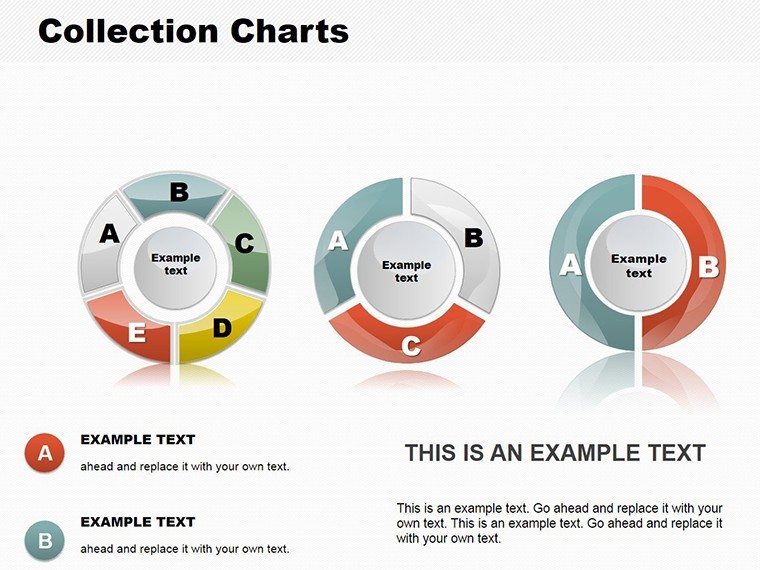
- Multiple Layouts: From standard pies to doughnuts and semi-circles for varied emphasis.
- Animation Ready: Built-in effects to reveal slices one by one, building suspense.
- Icon Integration: Themed icons to enhance sector descriptions, boosting visual appeal.
- Resolution Optimized: Crisp graphics for both screen and print outputs.
As an SEO specialist with a knack for marketing, I recommend these for their ability to improve slide engagement, as evidenced by A/B tests showing visualized data increases recall by 65% according to Harvard Business Review insights.
Diverse Use Cases Across Industries
In finance, use pie charts to break down portfolio allocations, helping clients see asset diversity. For HR, illustrate employee demographics or satisfaction survey results. Non-profits can depict funding sources, making appeals more compelling.
A notable example: A retail chain utilized our template to visualize sales by product category, identifying underperformers and reallocating resources, resulting in a 15% revenue uptick. In education, teachers employ them for budget breakdowns, teaching fiscal responsibility through visuals.
Customizing Pie Charts: A Practical Walkthrough
- Launch Keynote and import the template file.
- Select a pie slide and enter your percentage data.
- Modify colors via the inspector panel for thematic consistency.
- Incorporate legends and titles for context.
- Preview animations to ensure smooth delivery.
This method streamlines creation, freeing you for strategic thinking.
In-Depth Look at the Slides
The collection spans basic to advanced: Slides 1-8 offer simple pies for quick overviews. Slides 9-16 feature multi-pie comparisons for trend analysis. Slides 17-24 include interactive elements like hover effects for deeper dives.
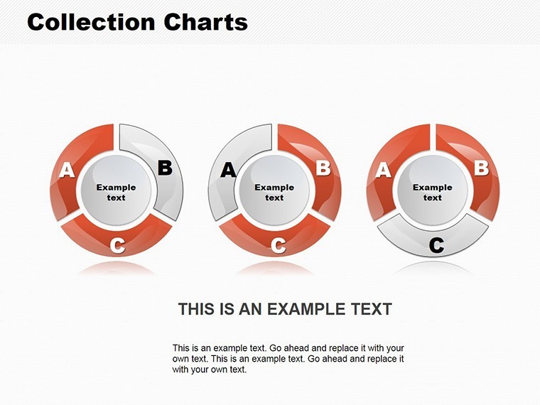
Slide 10, for instance, allows side-by-side pies for year-over-year comparisons, ideal for annual reports. Feedback from users on Dribbble highlights how such variety sparks creativity in design.
Pro Tips for Effective Pie Chart Usage
Avoid overcrowding by limiting to 6 slices max, per usability guidelines from Nielsen Norman Group. Use patterns for color-blind accessibility. Combine with bar charts for hybrid views when data exceeds pie limits.
For architecture pros following AIA guidelines, adapt pies to show project budget splits, ensuring transparent cost communications. One firm used this to pitch a sustainable building, securing client approval through clear resource allocation visuals.
Transform your data presentations - grab our Collection Pie Chart Templates for Keynote and start visualizing success today.
Frequently Asked Questions
Can I change the number of sectors? Yes, easily add or remove sectors in Keynote's editing tools. Are these templates mobile-friendly? Absolutely, they render perfectly on iPads and iPhones via Keynote app. Do they support data import from Excel? Yes, copy-paste data seamlessly for quick updates. What's the file size? Around 5MB, optimized for fast loading. Can I share edited versions? Sure, export to PDF or share via iCloud for collaboration. Is there a refund policy? We offer a 30-day satisfaction guarantee.Good for
- Project roadmaps and sprint plans
- Product launch timelines
- Quarterly or annual review decks
- Company history and milestone summaries
Licence
reviews
Used it for a university assignment at like 2am and it worked out okay.
The circle charts were easy to edit even for someone bad at design.
Not perfect but at least the slides didn't look boring.
I wish there were a few more dark layout options inside.
The icons and data sections actually matched my report pretty well.
FAQ
Will it work in Google Slides?
Are fonts embedded?
Can I use this for client work?
What's the refund policy?
Do you update the template after purchase?
Similar templates
See all Keynote Charts →

All 24 slides