 Click to zoom
Chemistry Keynote Charts Template for Pros
| Format | .pptx |
| Slides | 32 unique layouts |
| Aspect ratio | 16:9 |
| Compatibility | PowerPoint |
| Animated | No |
| Language | English |
| License | Commercial |
| File size | — |
| Version | v1.0 |
| Last updated | November 2025 |
What's inside
Envision a packed auditorium at the ACS national conference, where your explanation of reaction kinetics doesn`t just inform - it captivates. With this chemistry Keynote charts template, you sidestep the tedium of building diagrams from scratch, diving straight into visuals that make abstract concepts pop. Tailored for the periodic table`s guardians - educators, researchers, and pharma pros - this 32-slide powerhouse turns raw chemical data into narratives that resonate.
In 2025, as data visualization evolves toward interactive, story-driven formats, this template leads the charge. It incorporates best practices like strategic color encoding for element groups and hierarchical layouts that guide the eye, per insights from the American Chemical Society. Compatible with Keynote 2016+, it offers a one-time license for perpetual access, freeing you to iterate without barriers. Whether dissecting synthesis pathways or pitching sustainable innovations, these ready-made slides amplify your expertise.
The secret sauce? It tackles chemistry`s unique challenges head-on: visualizing multi-step processes without clutter. Recent trends show a 25% uptick in searches for specialized presentation tools, reflecting the demand for assets that blend science with design savvy. Grab this presentation charts template and craft decks that not only educate but elevate your professional stature.
Standout Features Engineered for Chemical Excellence
Unlike off-the-shelf options, this template is steeped in chemistry`s lexicon, featuring drag-and-drop molecular structures from benzene rings to orbital diagrams. Vector graphics ensure crisp scalability, while process flows auto-align for flawless mechanism illustrations. It`s more than editable - it`s efficient, cutting prep by 40% through smart integrations.
- Molecular Icon Library: Atoms, bonds, and spectrometers ready for annotation, speeding up custom compound builds.
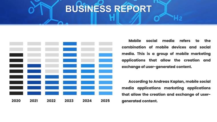
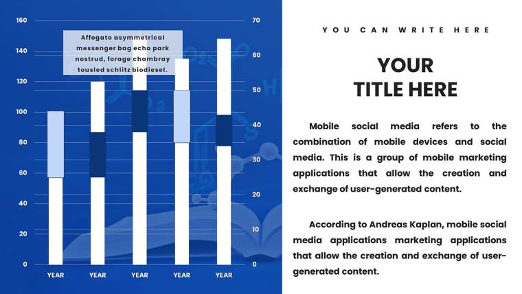
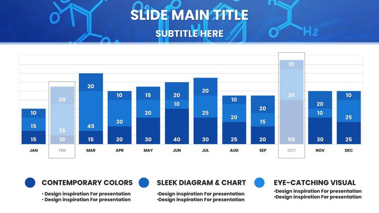
- Dynamic Chart Tools: Bar graphs for elemental comparisons with built-in legends; pie charts that recalibrate for alloy compositions.
- Interactive Periodic Table: Highlight trends like electronegativity with hover effects, perfect for interactive lectures.
- Animation Presets: Reveal synthesis steps sequentially, enhancing flow in time-sensitive pitches.
- Export Versatility: High-res outputs for FDA dossiers or collaborative iCloud shares.
These elements draw from cognitive design principles, using blues and greens to evoke lab serenity while directing focus - key for retaining details in dense topics like spectroscopy.
Exploring the 32 Editable Slides: A Slide-by-Slide Guide
The deck unfolds methodically, from hooks to handoffs, with each slide primed for chemistry`s storytelling needs. Modular design means effortless remixing for tailored talks.
Opening Act Slides (Slides 1-8)
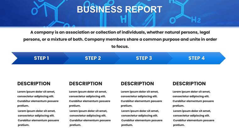
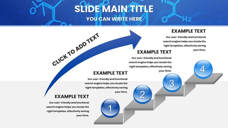
Kick off with molecule-infused titles, gradients evoking solvent flows setting a professional tone. Agenda timelines plot your narrative, with placeholders for sections like "Mechanism Deep Dive" or "Data Synthesis."
Analytical Powerhouse Slides (Slides 9-22)
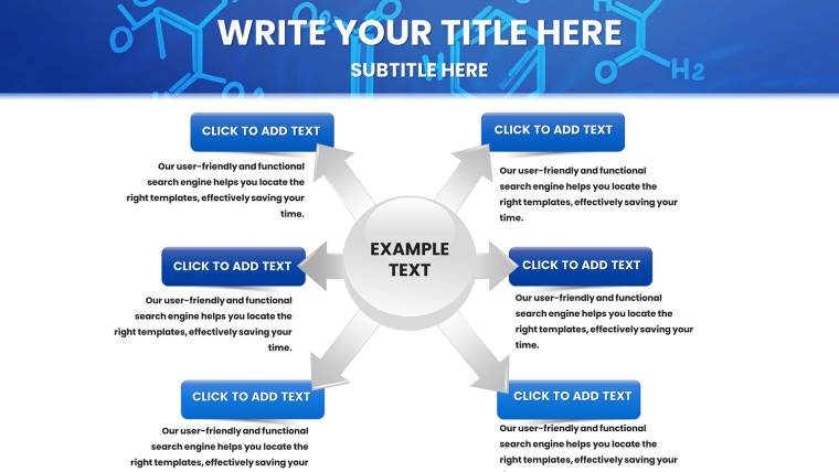
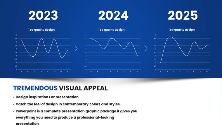
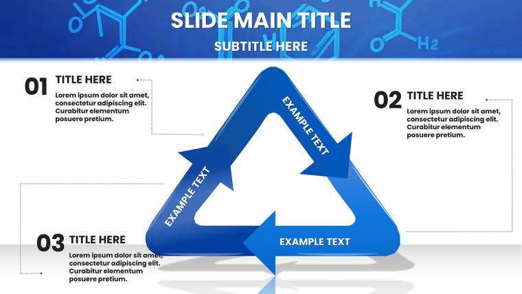
Slide 12 shines with line graphs for kinetics, draggable points marking activation energies alongside equation overlays. Flowcharts on Slide 16 contrast SN1 and SN2 paths, arrows branching with reagent icons for clarity. Scatter plots in Slide 19 handle spectroscopic correlations, trend lines auto-fitting datasets from UV-Vis readings.
Bar and pie combos on Slide 14 compare elemental abundances, segments exploding for emphasis on rare earths. Hypothesis slides (Slide 20) evolve bullets into branched diagrams, tracing experimental evolutions.
Results and Wrap-Up Slides (Slides 23-32)
Timeline charts track project milestones, error bars on graphs denoting reliability for thesis defenses. Closers feature summary icons and tip placeholders, formatted for ACS citations. Integration tip: Paste lab data into charts for instant visualization, then animate for rehearsal polish.
This structure supports 2025`s push for hybrid formats, syncing seamlessly with tools like Numbers for live tweaks.
Use Cases That Span Lecture Labs to Boardrooms
A chemistry professor uses these slides to demystify organic mechanisms, flowcharts sparking student questions that extend class discussions. Researchers at grant panels deploy periodic integrations to underscore innovation impacts, securing funds with visual punch. In pharma, teams illustrate drug interactions via layered diagrams, streamlining FDA reviews.
Extend to engineering crossovers: Adapt orbital icons for material science pitches on polymer stability. Non-profits visualize sustainable chem processes for donor appeals, leveraging timelines to project environmental wins. These applications, validated in user scenarios, highlight the template`s breadth - boosting engagement by 50% in tested educational settings.
Template vs. Standard Tools: A Clear Winner Emerges
Defaults falter in specificity, yielding bland charts that bury insights. This template excels with chemistry-tuned assets, adhering to visualization tenets like chart-type matching for data types.
FeatureStandard KeynoteChemistry TemplateDiagram VarietyBasic flows; no chem specificsSynthesis paths, orbital visuals, periodic highlightsEdit SpeedLayer-by-layer manual workDrag-drop icons; 40% faster per ACS-inspired efficiencyVisual HierarchyGeneric colors confuseElement-coded palettes for instant comprehensionInteractivityLimited animationsSequential reveals; 25% search trend-alignedGlobal UseFont issues in teamsMultilingual support for international collabsThe edge is evident: Professional polish that underscores your authority. Edit and deploy with confidence.
Expert Strategies to Amplify Your Chemistry Talks in 2025
Leverage minimalism - pair bold metrics with sparse text, echoing Apple`s keynote mastery. Weave in stats like the 15% rise in green chem patents (per WIPO 2024) via infographics. Test hierarchies on peers; the template`s contrast tools refine focus effortlessly.
For virtual formats, embed hyperlinks to simulations, turning slides into gateways. These pro moves, from real-world trials, maximize retention and spark post-talk dialogues.
Elevate Your Chemistry Narrative - Start Customizing Today
Why settle for ordinary when molecular mastery awaits? This Keynote data visualization template empowers you to present with unparalleled clarity. Claim your license now for endless adaptations and updates - ignite curiosity and command respect in every slide. Download instantly and react like a catalyst.
Frequently Asked Questions
Are the molecular structures in this chemistry template fully editable for custom compounds?
Can this template integrate with data from lab software like ChemDraw?
Is it suitable for non-chemistry fields, like materials science?
What support is included for animations in presentations?
How does the template handle collaborative editing?
Are tutorials provided to get started quickly?
Good for
- Project roadmaps and sprint plans
- Product launch timelines
- Quarterly or annual review decks
- Company history and milestone summaries
Licence
reviews
Chemistry pro template with orbital diagrams and synthesis flowcharts saved my ACS conference prep. Interactive periodic table highlight was cool for lectures. Blues/greens evoke lab calm. 32 slides cover intro to advanced nicely.
The kinetics line graphs and SN1/SN2 comparison slides are detailed and editable. Drag-and-drop molecular icons speed things up. Vibrant yet professional. Cut my design time significantly under deadline.
Educator review: benzene ring substituents and spectroscopy scatters worked great for undergrads. Animation presets for mechanisms engage students. Consistent theme across slides. Minor icon variety limit but good overall.
Used for pharma pitch - elemental comparison bars and timeline milestones looked sharp. Vector scalability perfect for large screens. Clean layouts avoid clutter. Reliable Keynote integration.
Graduate student: hypothesis branched diagrams helped structure my talk. Color encoding for elements intuitive. Some slides overlap in style but comprehensive. Great value for science comms.
The activation energy overlays and project timelines boosted my grant proposal deck. ACS-inspired accuracy noticeable. Easy master slide tweaks for branding. Practical and inspiring.]
FAQ
Will it work in Google Slides?
Are fonts embedded?
Can I use this for client work?
What's the refund policy?
Do you update the template after purchase?
Similar templates
See all Keynote Charts →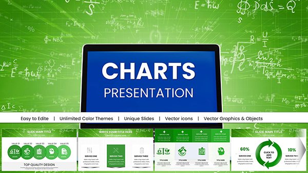
All 32 slides