 Click to zoom
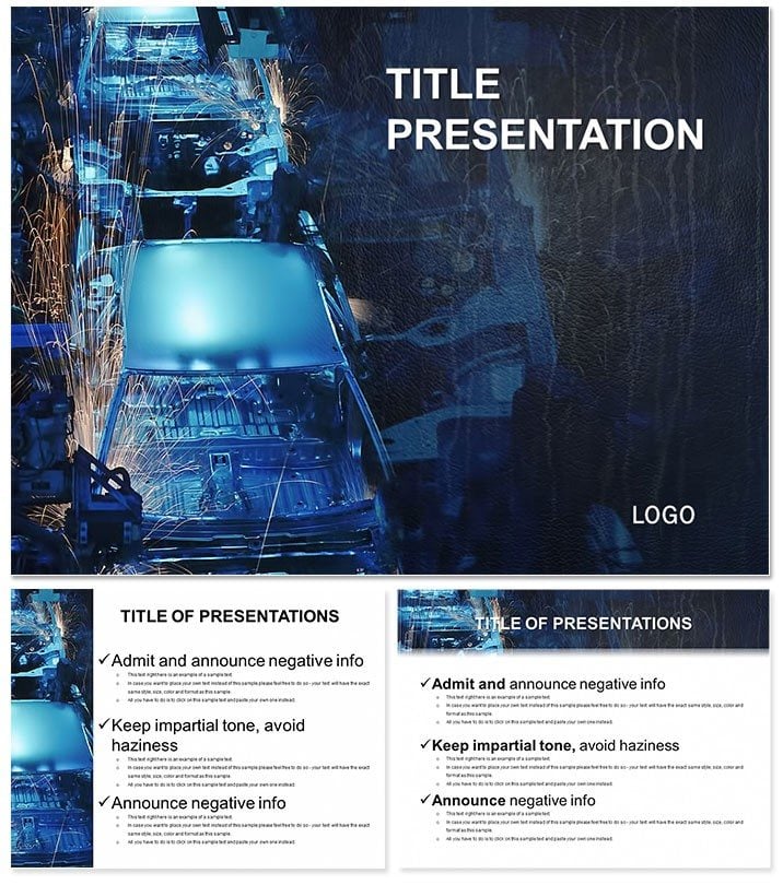
Automotive Industry Keynote Template: Accelerate Insights
| Format | .pptx |
| Slides | 3 unique layouts |
| Aspect ratio | 16:9 |
| Compatibility | PowerPoint |
| Animated | No |
| Language | English |
| License | Commercial |
| File size | — |
| Version | v1.0 |
| Last updated | October 2022 |
What's inside
In the high-octane arena of automotive production, clarity drives success - harness it with the Automotive Industry Keynote Template`s 28 diagrams that streamline process visualizations from assembly lines to supply chains. Built for industry leaders seeking optimization edges.
Three masters organize your flow: sequential for workflows, radial for supplier hubs, matrix for performance metrics. Three backgrounds evoke factory precision or road tests, with seven schemes tinting efficiency gauges. Keynote-ready for swift adaptations.
Dissect 28 Production-Focused Diagrams
Slide 4`s Gantt-style sequencer maps just-in-time deliveries. Slide 22`s bottleneck analyzers pinpoint delays with color-coded alerts. Animations sequence steps, revealing interdependencies like engine mating.
Plant managers track KPIs with dashboard integrations. Consultants model lean transformations via value stream maps. Vectors ensure detail retention at any zoom.
Integrate into Daily Drives
.key imports blend with existing decks; .kth enforces standards. Scale to widescreen for boardrooms. Embed ERP data for live updates.
For supplier audits, cycle time charts quantify variances. In R&D, prototype timelines forecast milestones. Trims 45% off build time over basics.
Industry Wins on Display
Exec Lee optimized a line with flow diagrams, cutting waste 15%. Designer Pia`s concept pitches convinced stakeholders via layered renders.
Outpace Plain Templates
Includes sector symbols like torque icons; $22 unlocks forever.
Fuel your strategy - download this template.
Frequently Asked Questions
Version support?
Keynote 2016+, macOS inclusive.
Data linking?
Yes, to Excel for dynamic metrics.
Colors for KPIs?
Seven, performance-tuned.
Group edits?
iWork collaboration enabled.
Formats?
16:9/4:3 adaptable.
Builds included?
Process-mimicking animations.
Good for
- Project roadmaps and sprint plans
- Product launch timelines
- Quarterly or annual review decks
- Company history and milestone summaries
Licence
reviews
I used the comparison charts for a small finance report and they fit well.
Not bad overall although some colors felt too dark during projection.
Finished my presentation faster because the layouts already had sections ready.
The infographic slides were useful but I deleted a few busy icon pages.
Worked okay for a team update meeting yesterday.
FAQ
Will it work in Google Slides?
Are fonts embedded?
Can I use this for client work?
What's the refund policy?
Do you update the template after purchase?
Similar templates
See all Keynote templates →


All 1 slides