 Click to zoom
Arrows Disintegration PowerPoint Charts: Break Down Ideas Visually
| Format | .pptx |
| Slides | 28 unique layouts |
| Aspect ratio | 16:9 |
| Compatibility | PowerPoint |
| Animated | No |
| Language | English |
| License | Commercial |
| File size | — |
| Version | v1.0 |
| Last updated | August 2023 |
What's inside
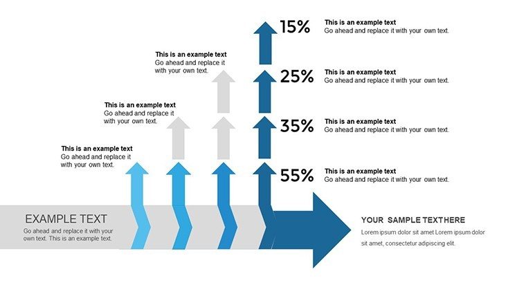
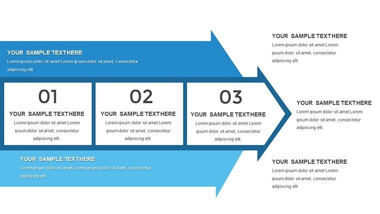
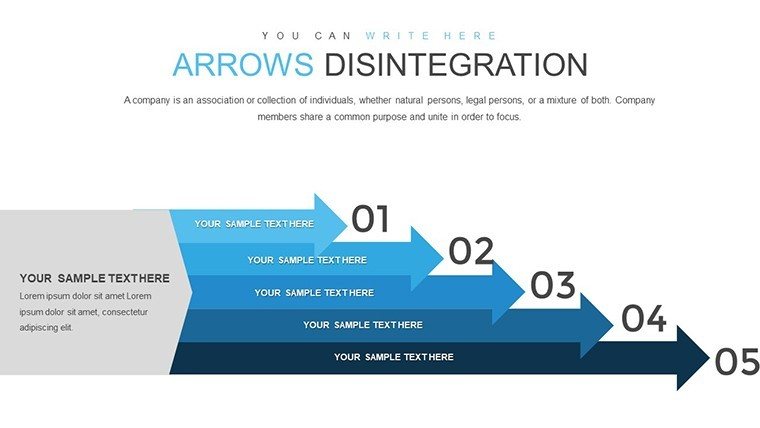
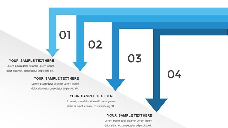
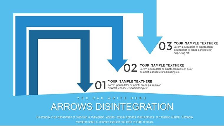
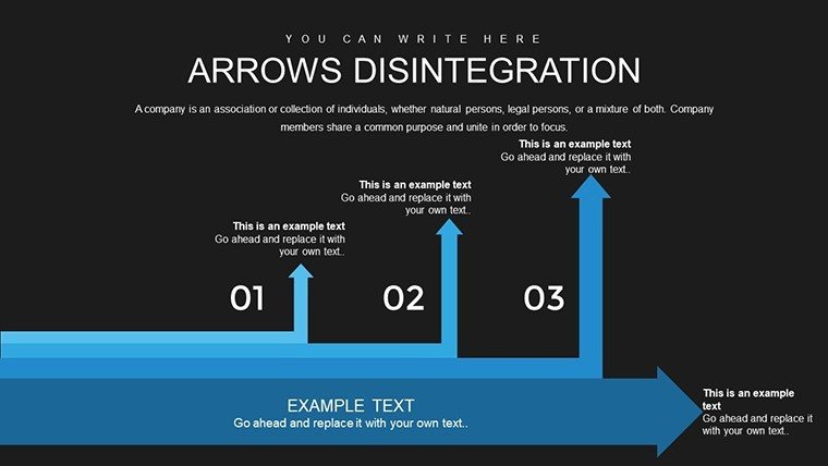
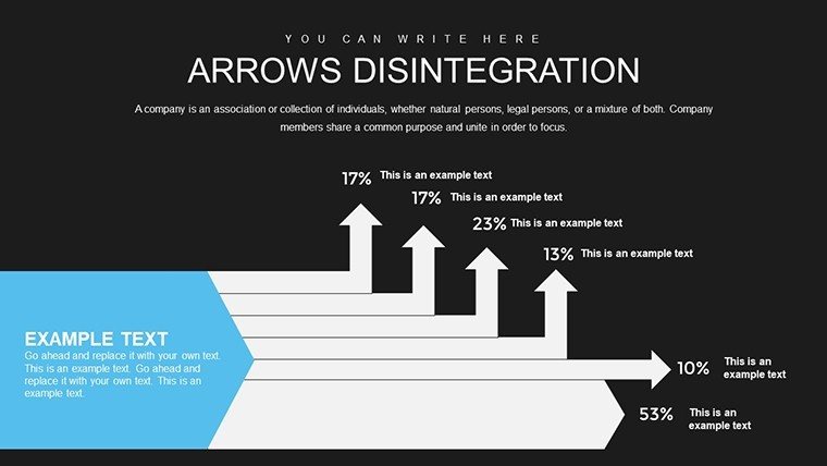
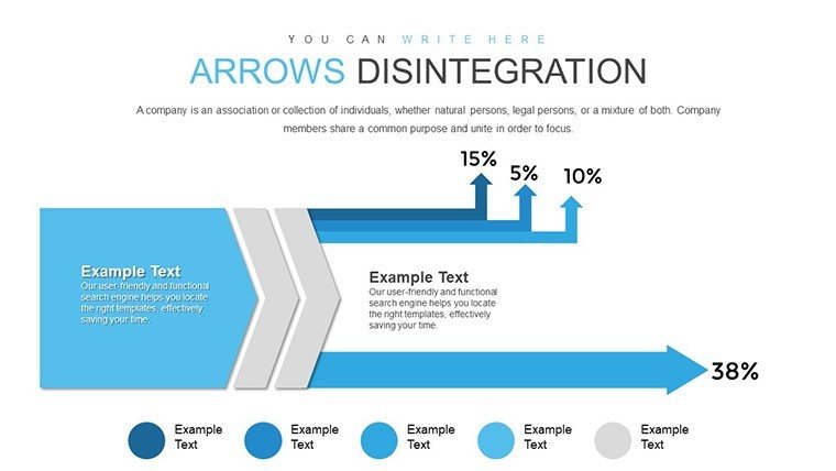
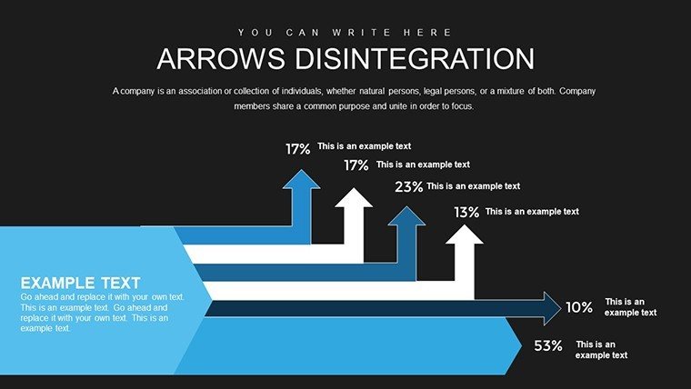
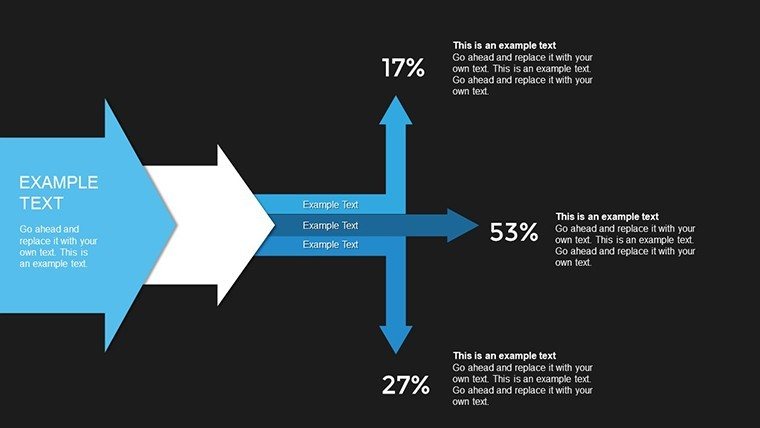
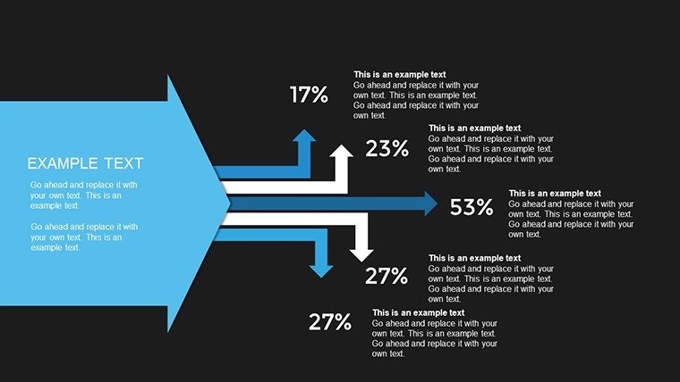
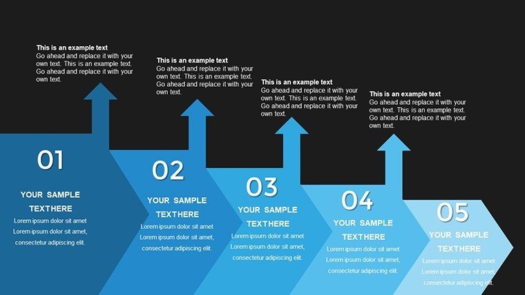
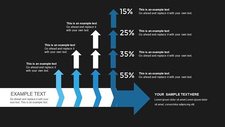
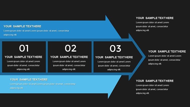
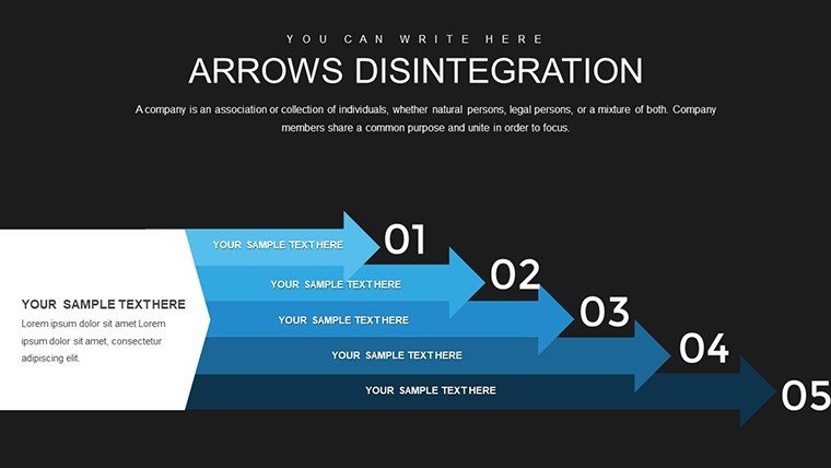
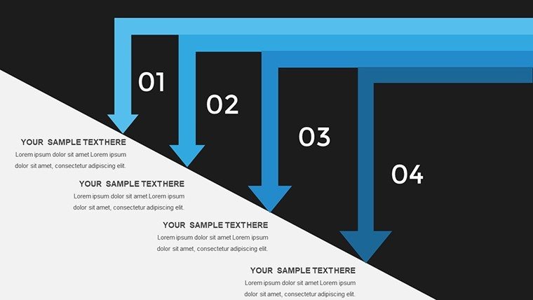
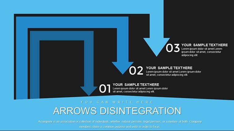
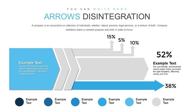
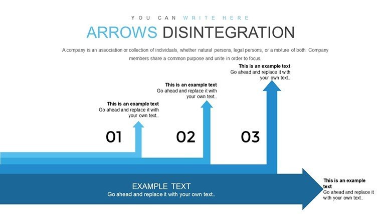
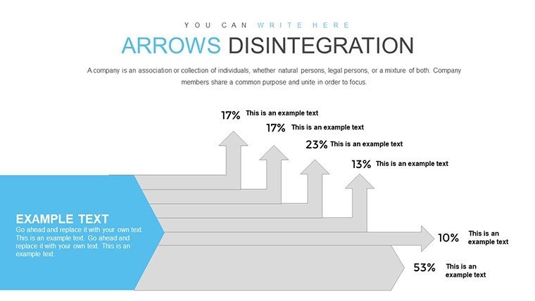
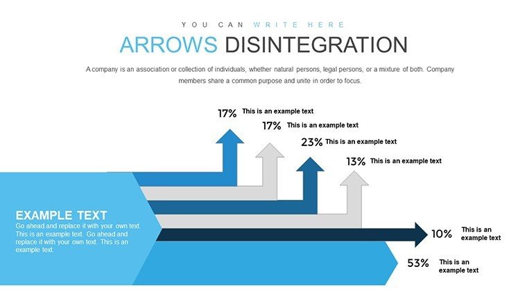
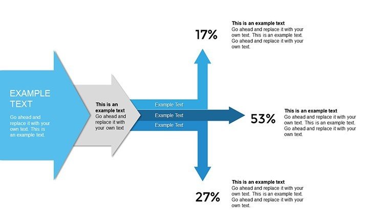
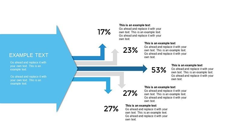
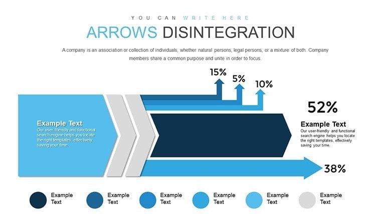
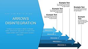
Ever struggled to explain intricate processes in a way that sticks? Our Arrows Disintegration PowerPoint Charts Template changes that game. Designed for dynamic presenters - sales pros, educators, and consultants - this 28-slide powerhouse uses striking arrow designs that 'disintegrate' into detailed components, making abstract concepts tangible. Visualize workflow breakdowns or idea evolutions with ease, turning potential confusion into clarity. For example, in a sales pitch, show how customer journeys fragment into touchpoints, inspired by funnel models from marketing gurus like Seth Godin. With HD graphics and seamless edits, this template saves time while amplifying impact, compatible with both PowerPoint and Google Slides for cross-platform versatility.
Standout Features for Engaging Presentations
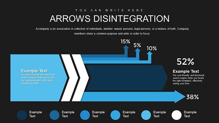
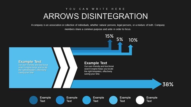
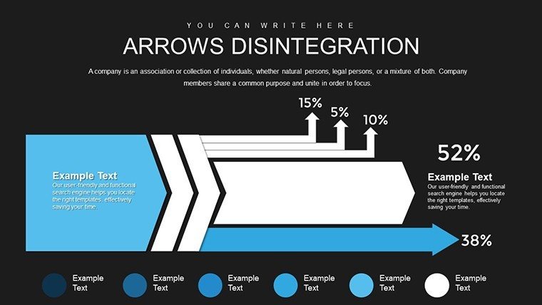
What elevates this template? Its core lies in the disintegration effect - arrows that visually fragment to reveal layers, perfect for deconstructing strategies. Each slide boasts high-definition visuals that shine on any display, from laptops to auditorium projectors. Customization is a breeze: tweak arrow directions, colors, and thicknesses to align with your narrative, perhaps shifting from bold reds for high-energy phases to subtle grays for breakdowns.
- Varied Arrow Styles: Curved, straight, or dotted arrows that disintegrate into icons or text boxes for multifaceted explanations.
- Data-Driven Placeholders: Quickly swap in your stats; ideal for metrics like conversion rates in marketing reports.
- Cross-Compatibility: Effortless use in Microsoft PowerPoint or Google Slides, no reformatting needed.
- Animation Integration: Built-in effects where arrows 'explode' into details, keeping viewers hooked.
- Brand Alignment: Fonts and palettes fully adjustable, ensuring consistency with your corporate identity.
Drawing from design principles in Edward Tufte's works on information visualization, these features minimize clutter and maximize comprehension, boosting your authority in fields like consulting.
Practical Applications Across Industries
In education, use these charts to dissect historical events, like the disintegration of empires into key factors, making lessons interactive and memorable. Consultants might employ them for process audits, illustrating how inefficiencies break down operations - think a case from McKinsey reports on supply chain optimizations. The benefits? Enhanced audience engagement, as visuals like these can increase retention by 42%, per cognitive psychology studies.
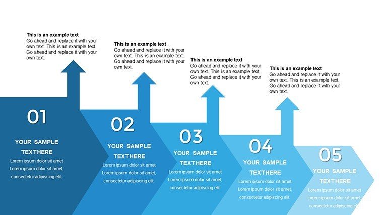
For project managers, map out task deconstruction in updates, showing how broad goals fragment into actionable steps, fostering team alignment. Unlike standard PowerPoint arrows, our disintegration designs add a narrative depth, turning slides into stories that persuade and inform.
Workflow Integration: From Concept to Delivery
- Identify Your Process: Pinpoint the idea or flow you want to break down, e.g., product development stages.
- Choose a Slide: Select an arrow style that fits - multi-branch for complex hierarchies.
- Customize Details: Input labels and data; animate for sequential reveals.
- Enhance with Icons: Add thematic graphics to each disintegrated part for visual punch.
- Rehearse and Refine: Test in presentation mode, adjusting for timing and flow.
This approach integrates with tools like Zoom for virtual sessions, where disintegration effects wow remote audiences. Compared to basic tools, it offers superior storytelling, aligned with UX best practices from Interaction Design Foundation.
Expert Tips to Amplify Your Charts
To get the most out, layer narratives: Start with a whole arrow for overview, then disintegrate for deep dives - mirroring techniques in TED Talks. Balance visuals with minimal text to avoid overload, per Gestalt principles. For virtual pitches, ensure animations load smoothly across devices. As a copywriter who's crafted content for design firms, I recommend testing with peers for feedback, enhancing trustworthiness in your deliveries.
Don't let ideas fall apart - disintegrate them purposefully. Download this template now and redefine your presentations.
Frequently Asked Questions
What makes the disintegration effect unique?
It visually breaks arrows into components, ideal for showing breakdowns without static lists.
Can I add my own animations?
Yes, override built-ins with custom ones in PowerPoint or Google Slides for personalized flair.
Is it suitable for beginners?
Absolutely - intuitive placeholders make editing straightforward, no design degree needed.
How do I handle large datasets?
Use multi-level disintegration slides to layer data hierarchically, keeping slides clean.
Are updates available?
Our site provides free updates for compatibility with new software versions.
Can it be used offline?
Yes, once downloaded, edit and present without internet.
Good for
- Project roadmaps and sprint plans
- Product launch timelines
- Quarterly or annual review decks
- Company history and milestone summaries
Licence
reviews
Used this while preparing a last minute sales recap.
The charts looked neat after adding my own numbers.
Some icons looked old school honestly.
Easy template if you just need structure and graphs.
I deleted a few busy slides and kept the simple ones.
FAQ
Will it work in Google Slides?
Are fonts embedded?
Can I use this for client work?
What's the refund policy?
Do you update the template after purchase?
Similar templates
See all PowerPoint Charts →
All 28 slides