 Click to zoom
Analytical Thinking PowerPoint Charts - Presentation Template
| Format | .pptx |
| Slides | 19 unique layouts |
| Aspect ratio | 16:9 |
| Compatibility | PowerPoint |
| Animated | No |
| Language | English |
| License | Commercial |
| File size | — |
| Version | v1.0 |
| Last updated | August 2023 |
What's inside
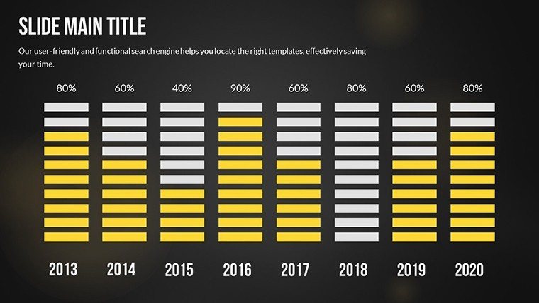
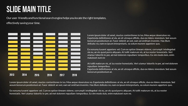
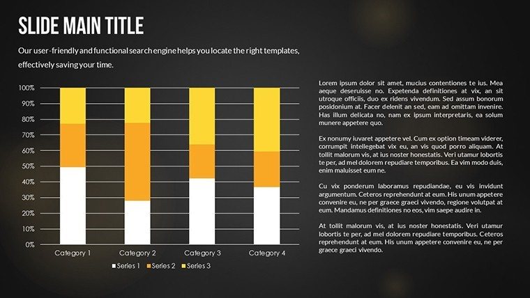
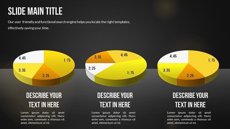
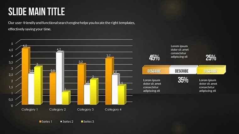
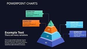
Diving deep into data can be overwhelming, but presenting it doesn't have to be. Our Analytical Thinking PowerPoint Charts Template turns intricate analyses into accessible, engaging stories. With 19 editable slides packed with bar graphs, pie charts, scatter plots, and more, this tool is crafted for those who thrive on insights. Business analysts spotting trends, educators simplifying theories, researchers pitching findings - all find solace here. Imagine distilling quarterly reports into visuals that highlight patterns without the clutter, or teaching statistical concepts with charts that spark curiosity. This template isn't mere decoration; it's a catalyst for clearer thinking and better decisions. By focusing on data-driven design, it helps you avoid common pitfalls like overcrowded slides, ensuring your message lands with impact. Step into a world where analysis meets artistry, and watch your presentations evolve from informative to unforgettable.
Harness Data Visualization for Deeper Insights
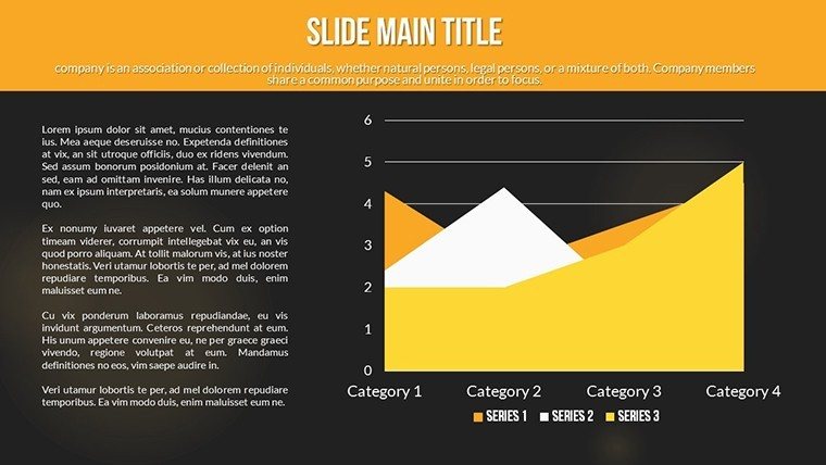
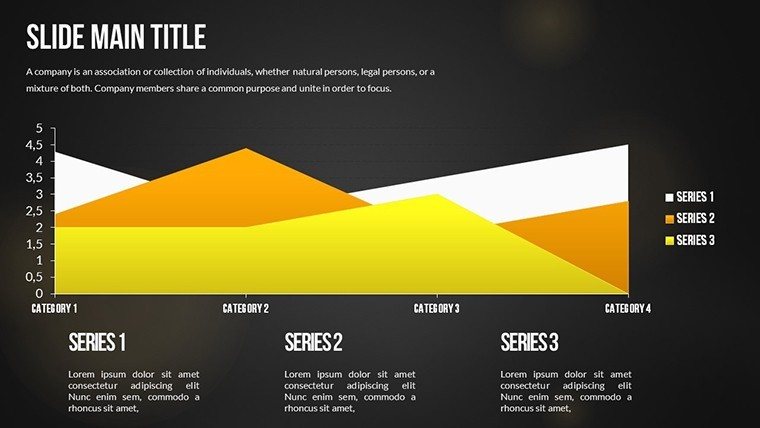
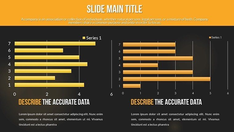
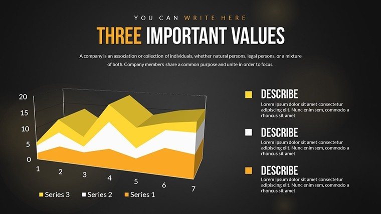
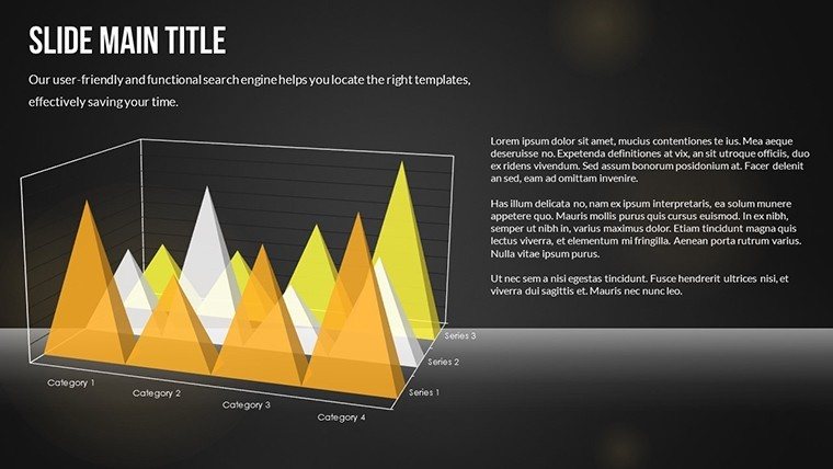
Effective analytical thinking demands tools that reveal hidden stories in data. Our template provides just that, with a variety of chart types optimized for clarity. For example, scatter plots excel at showing correlations, like sales versus marketing spend in a business context, drawing from real-world applications seen in McKinsey reports. Pie charts break down compositions, such as market share distributions, while bar graphs compare categories effortlessly. Each slide is built with user-friendly interfaces, allowing quick data entry and automatic updates - far superior to manual charting in standard software, which often leads to inconsistencies.
Personalization Options That Empower Creativity
Customization is key to making data resonate. Adjust color schemes to evoke emotions - cool blues for calm analyses or vibrant reds for urgent trends. Fonts and layouts can be tweaked for accessibility, adhering to design standards like those from the Nielsen Norman Group. Researchers might customize scatter plots to overlay regression lines, illustrating predictive models in grant proposals. This flexibility ensures your presentations align with personal or organizational styles, boosting engagement and perceived professionalism.
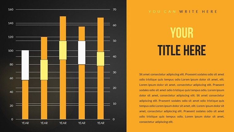
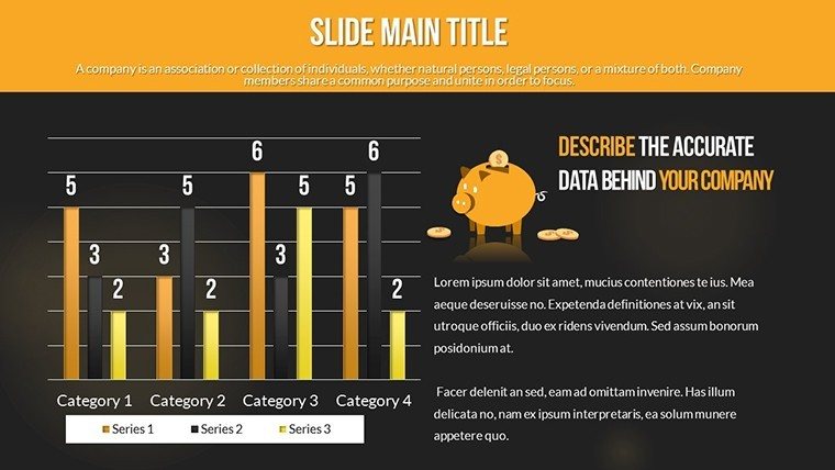
- Bar Graphs: Compare metrics across groups with stacked or clustered options.
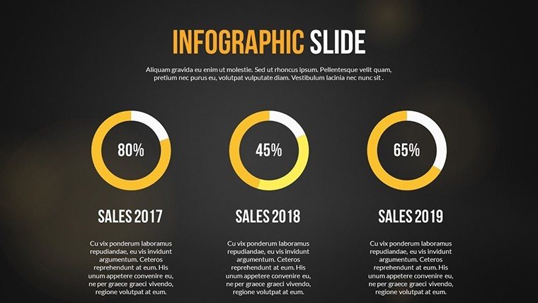
- Pie Charts: Visualize proportions for quick percentage insights.
- Scatter Plots: Identify relationships and outliers in datasets.
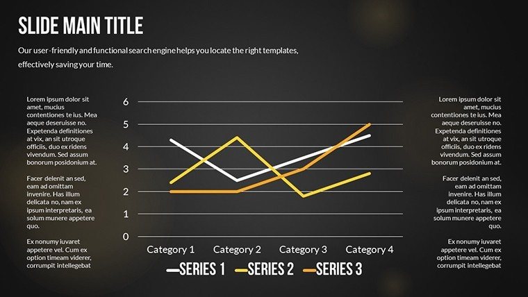
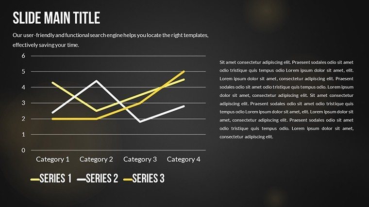
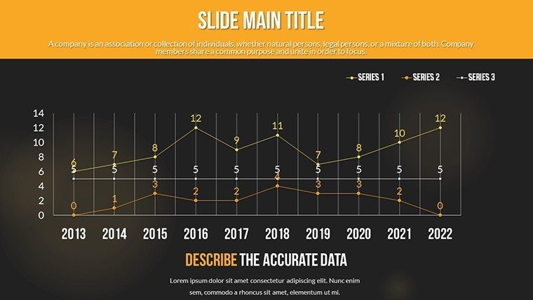
- Line Charts: Track trends over time, like revenue growth.
Tailored Use Cases Across Industries
Envision a business analyst reviewing performance data. They use line charts to trace quarterly trends, adding annotations for key events like product launches, similar to how Google Analytics visualizations aid decision-making. Educators employ pie charts to teach probability, making abstract concepts concrete for students. Researchers, perhaps in academia, leverage scatter plots to present experimental results, securing collaborations by clearly demonstrating correlations. These scenarios highlight the template's versatility, solving pain points like data overload by prioritizing visual hierarchy.
Step-by-Step Workflow for Analytical Presentations
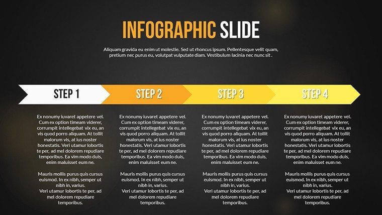
- Gather Data: Compile your metrics from sources like Excel or databases.
- Choose Chart Type: Match visuals to your analysis - e.g., bars for comparisons.
- Customize Aesthetics: Apply branding and refine for clarity.
- Add Insights: Include labels, legends, and notes for context.
- Review and Iterate: Ensure accuracy and flow before finalizing.
- Deliver Impactfully: Present with confidence, knowing visuals support your narrative.
This methodical process outperforms basic PowerPoint by incorporating analytical best practices, reducing preparation time while enhancing output quality.
Standing Out in a Sea of Data
Basic tools often yield flat visuals, but our template infuses professionalism with polished aesthetics. Features like gradient fills and subtle shadows add depth without distraction, inspired by data viz experts like Edward Tufte. Benefits include higher audience retention - studies show well-designed charts increase comprehension by up to 40%. For educators, this means better student outcomes; for analysts, it translates to actionable recommendations that drive business value.
Incorporating Advanced Elements
Elevate with themed elements, such as icons for data points or interactive tooltips (in presentation mode). These touches make complex analyses approachable, fostering discussions in meetings or classrooms.
Seamless Integration and Tips
Compatible with PowerPoint and Google Slides, integrate into workflows like sharing via OneDrive for team reviews. Tips: Use consistent scales for fair comparisons; avoid chartjunk for clean designs. This template becomes a go-to resource, streamlining analytical communication.
In essence, our Analytical Thinking PowerPoint Charts Template empowers you to think deeper and present smarter. Download now and turn data into your strongest ally.
Frequently Asked Questions
What chart types are included?
A variety including bar, pie, scatter, and line charts for diverse analytical needs.
Can I edit the charts in Google Slides?
Yes, full compatibility ensures easy editing across platforms.
Who is this template best for?
Business analysts, educators, and researchers seeking data-driven presentations.
How do I customize colors?
Simply select elements and apply your preferred schemes via the interface.
Is there a trial version?
No, but instant download allows quick evaluation post-purchase.
Good for
- Project roadmaps and sprint plans
- Product launch timelines
- Quarterly or annual review decks
- Company history and milestone summaries
Licence
reviews
Used it for a startup pitch and the graph pages looked clean during the Zoom call.
I changed the colors because the default ones felt too dark for my taste.
The slide order already made sense so I barely had to rearrange anything.
Helpful for a quarterly office report since the charts were already formatted.
Honestly just grabbed it because I was running out of time and it worked.
FAQ
Will it work in Google Slides?
Are fonts embedded?
Can I use this for client work?
What's the refund policy?
Do you update the template after purchase?
Similar templates
See all PowerPoint Charts →
All 19 slides