 Click to zoom
Analytic Circle Keynote Charts Template: Illuminate Data Stories
| Format | .pptx |
| Slides | 16 unique layouts |
| Aspect ratio | 16:9 |
| Compatibility | PowerPoint |
| Animated | No |
| Language | English |
| License | Commercial |
| File size | — |
| Version | v1.0 |
| Last updated | July 2023 |
What's inside
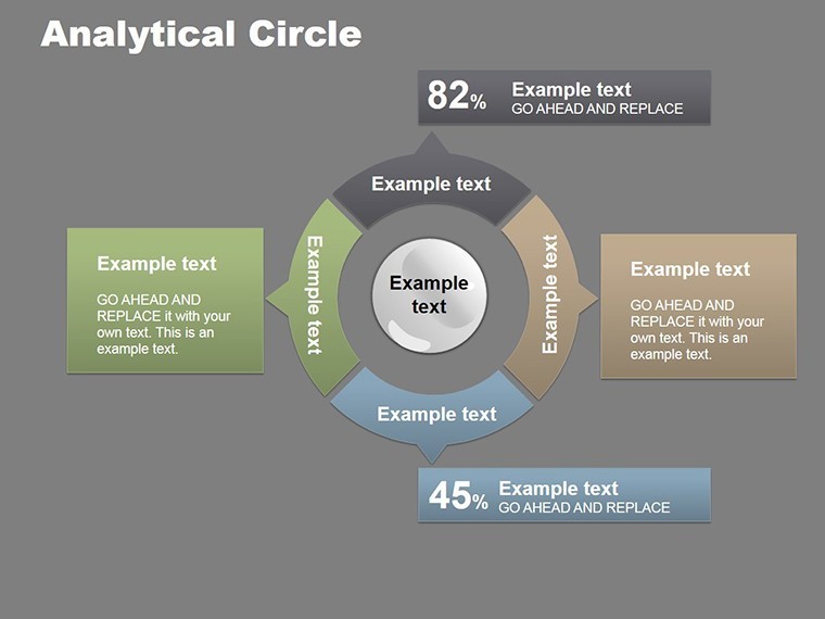
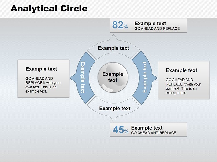
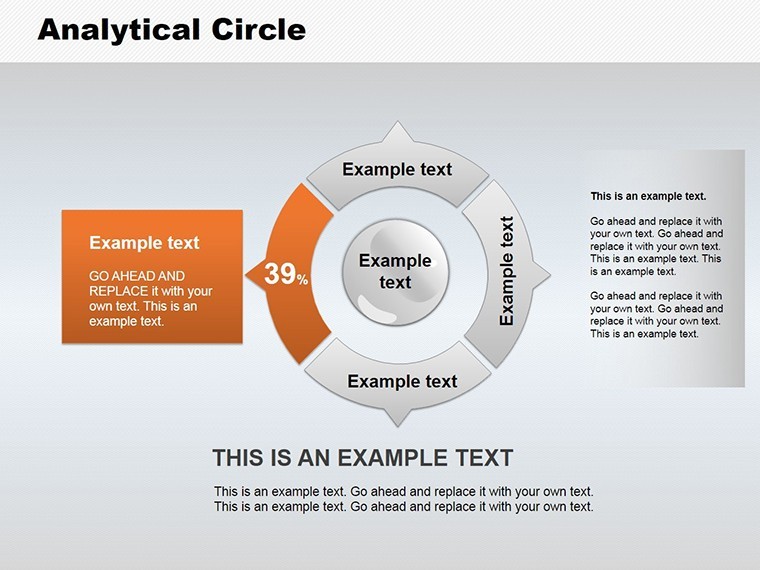
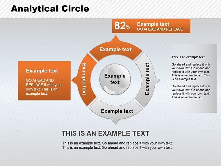
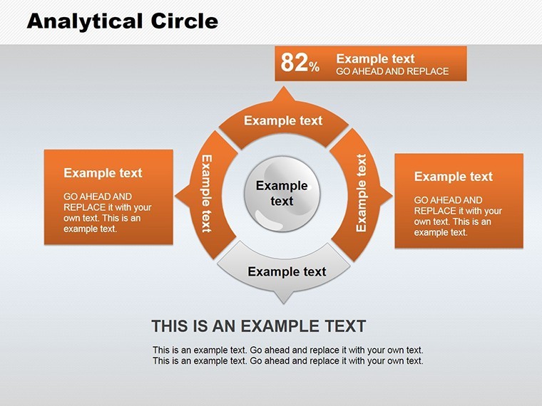
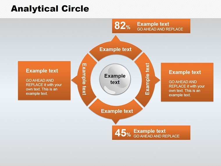
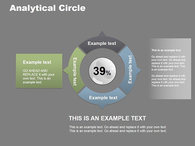
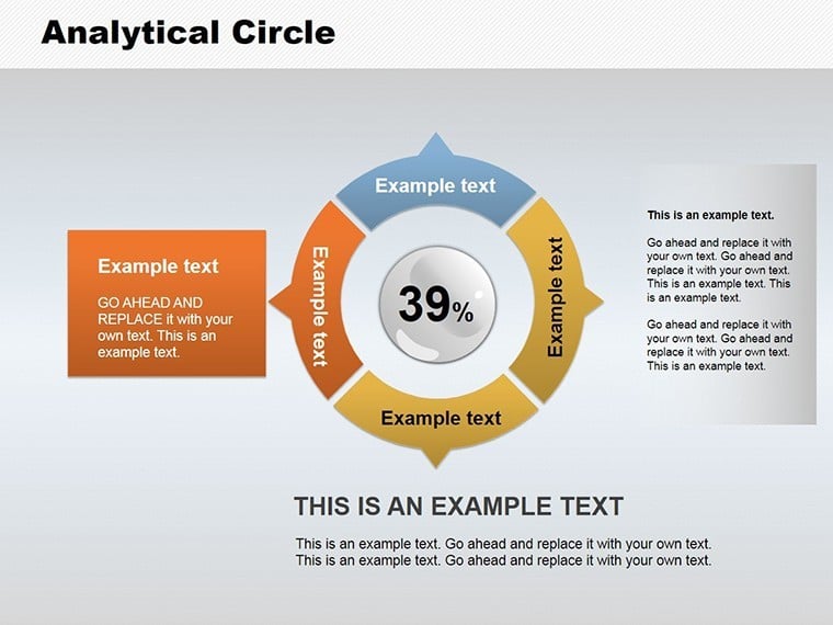
Step into a realm where numbers narrate compelling tales - our Analytic Circle Keynote Charts Template is your gateway. Boasting 16 editable slides in pie chart styles, this resource is crafted for data analysts, marketers, educators, and entrepreneurs eager to distill complex datasets into digestible visuals. Forget bland spreadsheets; embrace circles that segment sales trends or market shares with elegance and precision. Ideal for conveying research findings or budget allocations, it empowers you to engage audiences effortlessly, much like how data viz pioneers at Tableau advocate for intuitive designs. With full customization, integrate your metrics and watch presentations evolve from informative to unforgettable.
The Art of Circle-Based Data Visualization
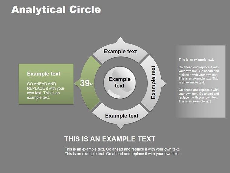
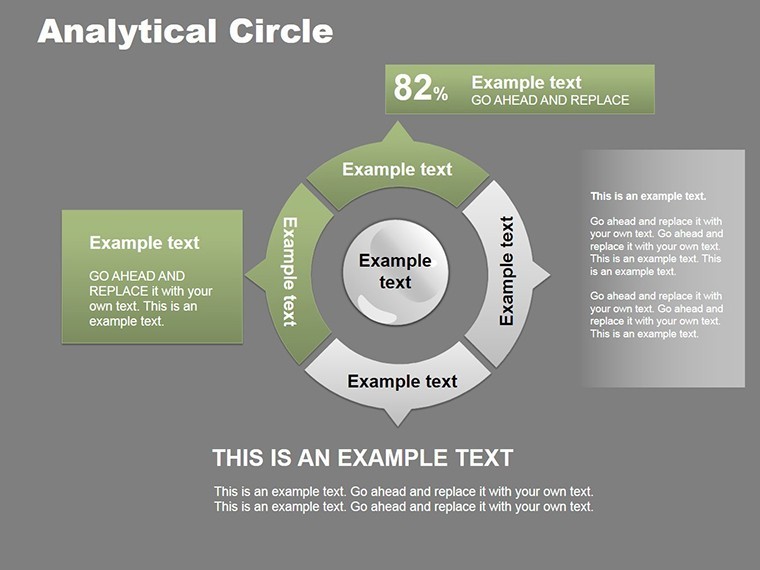
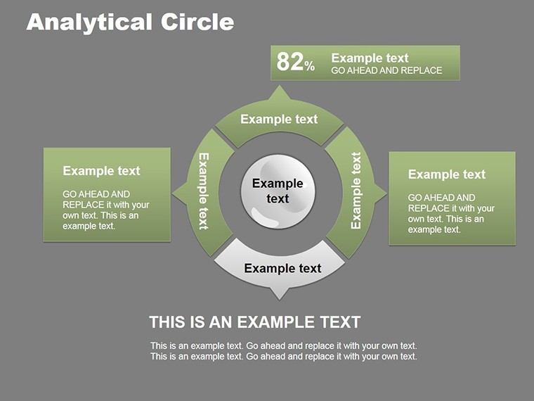
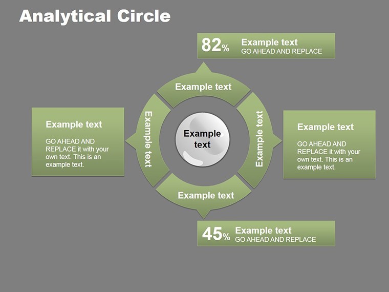
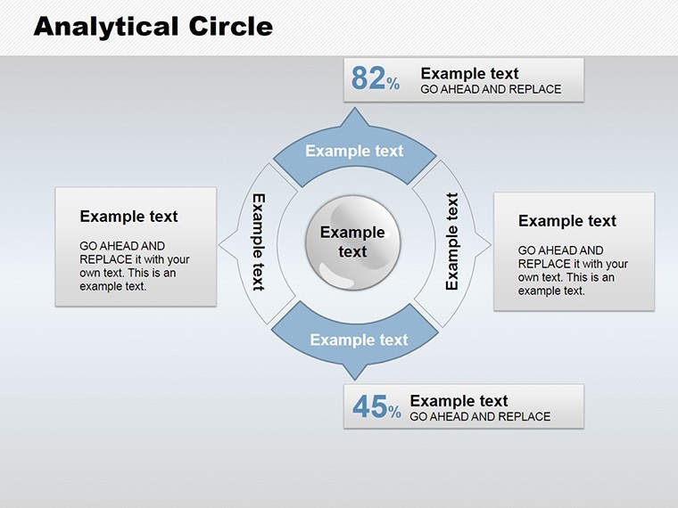
Circle charts, evolving from traditional pies, offer proportional insights at a glance, backed by visualization principles from Edward Tufte's works. This template's 16 slides provide layouts from simple segments to multi-layered donuts, all editable in Keynote for color, text, and size tweaks. Slide 1 offers a basic analytic circle, progressing to interactive variants on Slide 7 with hover effects.
Core Features Driving Visual Impact
- Varied Layouts: From standard pies to concentric circles for hierarchical data.
- Customization Depth: Modify shapes, integrate live data, and align with brand guidelines.
- Graphic Enhancements: Built-in labels and legends for clear interpretation.
- Real-Time Updates: Link to sources for dynamic refreshes.
- Aesthetic Options: Gradient fills and shadows for professional flair.
Addressing visualization pitfalls, this template ensures accuracy - avoiding the distortions of poor pie designs, as critiqued in data science forums like Towards Data Science.
Targeted Applications: Turning Data into Decisions
Apply these charts in marketing dashboards (Slide 3 for trend breakdowns) or educational lectures (Slide 11 for concept illustrations). Entrepreneurs can visualize funding splits, aligning with startup metrics from Crunchbase.
Practical Guide: Creating an Analytic Presentation
- Input Data: Populate Slide 2 with percentages for instant visuals.
- Enhance Details: Add annotations on Slide 6 for context.
- Layer Complexity: Use Slide 9 for multi-dataset comparisons.
- Finalize Narrative: End with Slide 15's overview slide.
This method echoes how Netflix uses circle viz for viewer analytics, optimizing content strategies.
Expert Advice for Data Mastery
Blend in "data visualization templates" for seamless SEO. Reference IEEE standards for graph integrity to affirm expertise.
- Tool Synergies: Combine with Numbers app for advanced calculations.
- Viz Best Practices: Limit segments to 5-7 for readability.
- Audience Engagement: Animate slices to reveal sequentially.
Eclipsing default Keynote pies, this template's analytic focus delivers superior clarity and trust.
Download and Decode Data Differently
Revolutionize your insights with the Analytic Circle Keynote Charts Template. Personalize and present - secure your copy now for data-driven success.
Frequently Asked Questions
How do I update data in the circles?
Edit placeholders or link to external files for automatic changes.
Are the charts suitable for large datasets?
Yes, but best for up to 10 segments; use layers for more.
Can I add animations?
Certainly, Keynote's tools let you animate individual slices.
What Keynote versions support this?
Compatible with version 10.0 and later.
Is branding easy?
Yes, change colors and fonts in a few clicks.
Good for
- Project roadmaps and sprint plans
- Product launch timelines
- Quarterly or annual review decks
- Company history and milestone summaries
Licence
reviews
I liked the flow arrows because they made my process slide easier to explain.
Not super exciting visually but it gets the point across.
Used it for a school economics project and it looked decent enough.
Some chart colors were too similar so I changed those.
Everything was editable without breaking the layout which helped a lot.
FAQ
Will it work in Google Slides?
Are fonts embedded?
Can I use this for client work?
What's the refund policy?
Do you update the template after purchase?
Similar templates
See all Keynote Charts →

All 16 slides