 Click to zoom
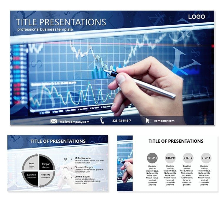
Analysis Trading PowerPoint Template: Perspective in Every Plot
| Format | .pptx |
| Slides | 3 unique layouts |
| Aspect ratio | 16:9 |
| Compatibility | PowerPoint |
| Animated | No |
| Language | English |
| License | Commercial |
| File size | — |
| Version | v1.0 |
| Last updated | October 2021 |
What's inside
In the realm of economics and business ideation, where ideas must not just inform but elevate the presenter`s stature, the Analysis Trading PowerPoint template emerges as a refined ally. Tailored for analysts, strategists, and executives dissecting markets, it packs 28 diagrams into three masters and backgrounds that whisper sophistication. Seven color schemes - from slate econometrics to amber opportunities - empower you to frame analyses that shift viewpoints, turning data deluges into decisive dialogues.
Envision a client consult: Diagrams that pyramid economic indicators, cresting with actionable angles. Aimed at pros placing pivotal info, it promises polish that persuades, boosting your boardroom presence.
Foundational Features: Diagrams for Depth
Its 28 diagrams anchor the appeal, artfully angled for analytical arcs. Entry layouts lean on ledger lines, while standouts like page 8`s perspective prisms refract trends through multi-lens views.
- Insight Icons: Scalable shards for sectors, swaps, and sums, primed for précis.
- Backdrop Builds: Three tiers, like faint fractal fields, to underpin without upstaging.
- Hue Horizons: Seven spans, cool for cautions or warm for windfalls.
A Berlin consultancy channeled these for econ overviews, prisming GDP gears - the angled insights angled alliances anew.
Build Blueprint: From Data to Discourse
Instigate in PowerPoint 2016+, opting a master with metric motifs. Diagram 15`s econ ecosystem? Seed with sector stats - sprouts sectors swiftly.
- Seed Sources: Slot stats from SAS into shapes for seamless syncs.
- Hone Hues: Harmonize to schemes, highlighting highs with halos.
- Layer Lenses: Lash labels to layers, detailing dynamics deftly.
- Rehearse Reveals: Rhythm rotations on radial risks, readying for rounds.
Trumps tabula rasa by templating thought, so you theorize over tinkering - perspectives prosper.
Contextual Cases: From Firm Forecasts to Idea Incubators
Pivots playfully: Forecast forums favor forecast funnels on page 23, funneling futures fluidly. Idea incubators? Interlink infographics for ideation ignition.
One exec etched these into equity evals, ecosysteming enterprises - the ecosystems echoed excellence. For think-tank talks, tiered tables tally theories, tabling takeaways tidily.
Outshines ordinaries: Aligned asymptotes in growth graphs guarantee geometric grace.
Stakeholder Shades: Suits to Scholars
Shade for spheres - for suits, succinct summaries; scholars savor sub-strata. Scheme to stoic for studies or spirited for sparks.
Nudge: Nest slide 29`s nexus with normative nods, nodding to neoclassics neatly.
Analytical Aids: Elevating Execution
Blend with Bloomberg bits into bays for bolstered briefs. Cohort crafts? .potx pulses in platforms for pooled polish. Press pauses in packed panes with précis panels, parsing particulars promptly.
Orchestrate orbit opens on opportunity orbs, orbiting outcomes organically. These tweaks transmute talks into triumphs.
Procure the Analysis Trading PowerPoint template for $22 and plot paths to persuasion. Your perspective prevails.
Frequently Asked Questions
Formats furnished?
.potx predominates, .jpg supplements.
Diagram depth?
28, delving diagrams diversely.
Version vista?
2016+ prime; 2013 passable.
Scheme symphony?
Slide-specific, for sectional shifts.
Data docking?
Excel echoes in elements.
Icon inventory?
Insightful, from indices to integrals.
Good for
- Project roadmaps and sprint plans
- Product launch timelines
- Quarterly or annual review decks
- Company history and milestone summaries
Licence
reviews
Had a consulting deck due and the perspective prisms on page 8 helped me illustrate multi-lens views of the market.
The seven color schemes are great, but I found the 'slate econometrics' one a bit too dark for a printed handout.
Used the funnel diagram for a quarterly forecast and it presented our pipeline much better than my usual messy charts.
The alignment on the asymptotes in the growth graphs is spot-on, saved me from manually adjusting curves for an hour.
For an economic analysis, the 'amber opportunities' scheme added just enough visual pop without looking unprofessional.
FAQ
Will it work in Google Slides?
Are fonts embedded?
Can I use this for client work?
What's the refund policy?
Do you update the template after purchase?
Similar templates
See all PowerPoint Templates →



All 1 slides