 Click to zoom
Agile Development Charts PowerPoint Template
| Format | .pptx |
| Slides | 14 unique layouts |
| Aspect ratio | 16:9 |
| Compatibility | PowerPoint |
| Animated | No |
| Language | English |
| License | Commercial |
| File size | — |
| Version | v1.0 |
| Last updated | November 2025 |
What's inside
Every week, I coach project leads on turning sprawling backlogs into focused action plans, and let me tell you, nothing bridges the gap between vision and execution like a well-crafted chart. This Agile Development Charts PowerPoint Template has been my secret weapon for those moments - 14 slides that strip away the complexity of iterative workflows, letting you spotlight what`s moving the needle in your builds or campaigns.
Think back to a recent team huddle where timelines blurred and priorities shifted mid-discussion. With this template, you`d flip to a Gantt slide plotting sprints as horizontal bars, each labeled with phases from ideation to deployment. Dependencies link via arrows, making it obvious if a delay in testing ripples forward. Consultants I`ve worked with swear by it for client updates, as it turns vague "we`re on track" assurances into tangible proof.
Streamlining Sprints With Built-In Timelines
Project managers, this one`s for you. The Gantt charts here aren`t rigid spreadsheets disguised as visuals; they`re flexible timelines where you adjust bar lengths to match your sprint durations - two weeks or a full quarter. Milestones pop as diamonds along the top, with swimlanes below dividing tasks by team member or function. In a recent architecture firm pivot to agile design, we used this to sequence site mockups, revealing overlaps that shaved two weeks off approvals.
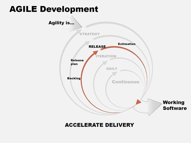
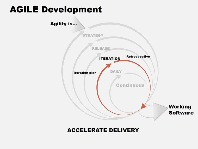
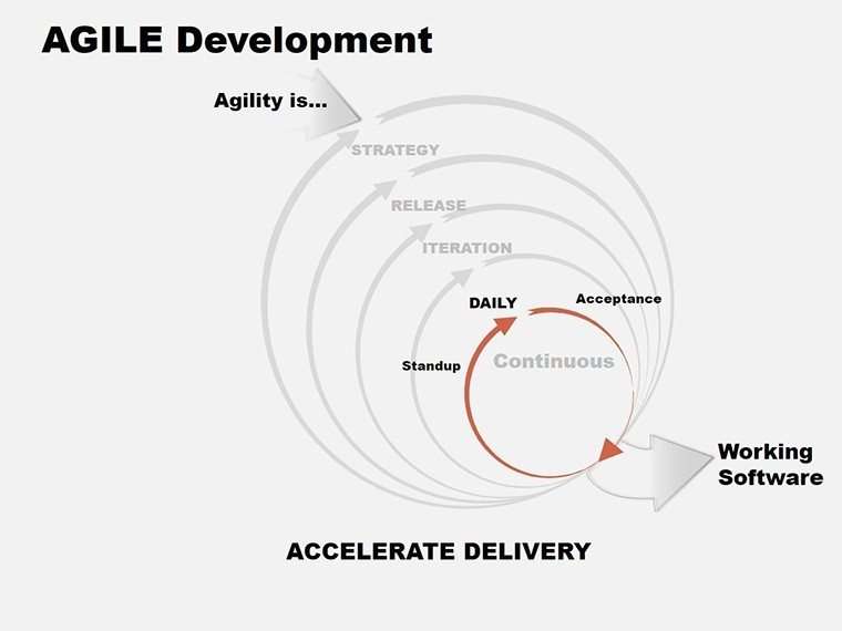
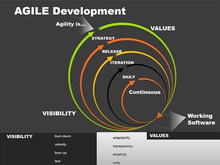
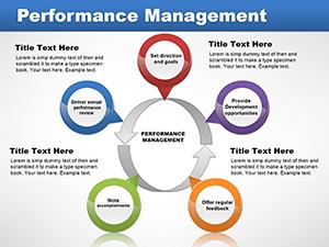
Pair it with process flow slides that use curved arrows to loop through cycles: gather requirements, prototype, test, refine. Each step has a dedicated box with space for key deliverables, helping cross-functional groups like devs and designers see handoffs clearly. It`s especially handy for urban planners mapping phased developments, where one tweak upstream affects the whole build.
Resource Breakdowns That Tell the Real Story
Marketers scaling content pipelines often wrestle with allocation - how much to dev vs. creative? Enter the pie charts: Clean segments for budget splits, effort distribution, or feature priorities, with percentages that auto-calculate as you edit. Customize the wedges to highlight imbalances, like overcommitting to polish at the expense of new features, and watch your audience nod in agreement.
For deeper dives, roadmap slides stretch visions across horizons. A central arrow bisects short-term backlogs on one side - prioritized tickets in stacked lists - and long-term goals on the other, like platform expansions. Founders pitching growth strategies find this layout persuasive; it frames agile as a accelerator, not a buzzword, by showing iterative wins building toward big leaps.
From Workshops to Boardrooms: Versatile Applications
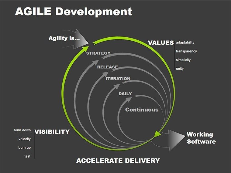
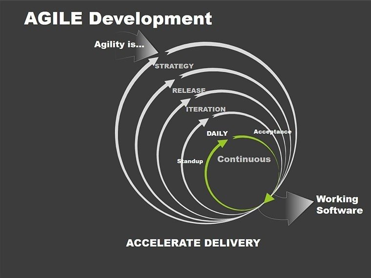
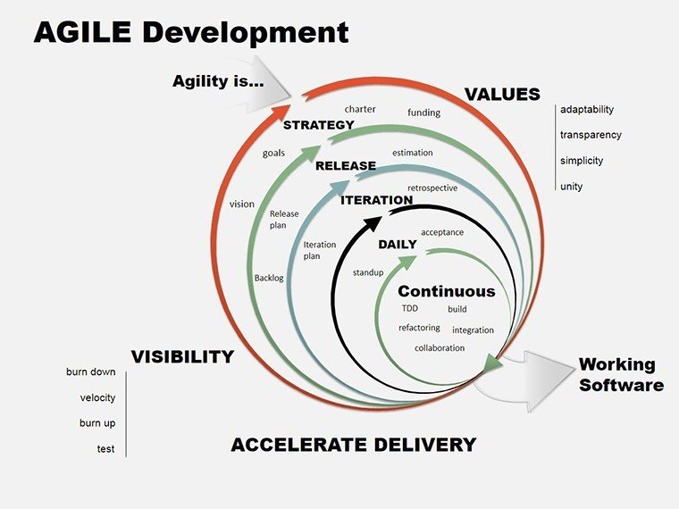
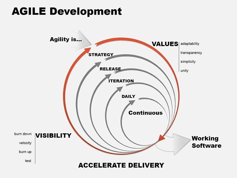
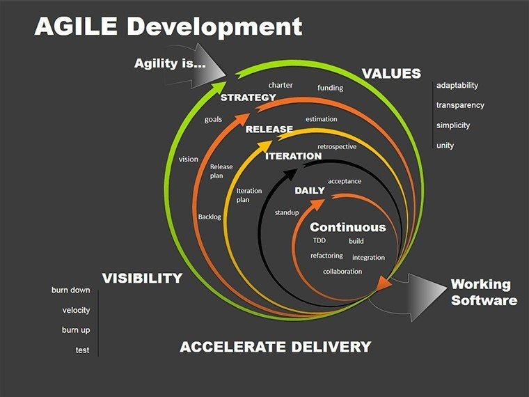
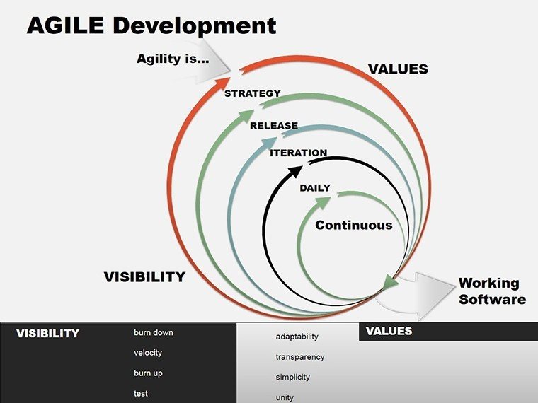
Educators introducing agile in classrooms can leverage the overview diagram - a central hub with spokes for values like collaboration and adaptability. Bullets expand on each, turning theory into discussion starters. I`ve facilitated sessions where teams role-play using these, emerging with custom workflows that stick.
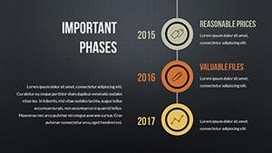
In corporate reporting, progress trackers shine. Arrows point to completion metrics, pie slices show achievement rates, and it`s all editable to reflect real-time shifts. A tech firm client used it for quarterly reviews, aligning execs on deliverables and sparking buy-in for the next phase without endless Q&A.
Even in startups, where resources are tight, this template`s drag-and-drop icons - gears for processes, targets for milestones - keep things lightweight. Resize, recolor, or layer in your data from sheets, and you`re set for investor decks that convey momentum without overwhelming details.
Effortless Tweaks for Lasting Impact
Built for speed, every chart pulls colors from your theme, ensuring cohesion whether you`re presenting in a dim conference room or via video. Animations are minimal - a gentle build on arrows to trace flows - keeping focus on insights, not effects. It`s PowerPoint-native, so no learning curve; just import your numbers and go.
Over the years, I`ve seen this style of charting foster tougher conversations, like reallocating underused skills, leading to more balanced teams. Grab this template, slot in your latest sprint data, and elevate your next strategy talk - it`s designed to make agility feel achievable from the first slide.
Frequently Asked Questions
How does this template handle cross-team dependencies?
Gantt slides use linking lines to show impacts, making it simple to spot and discuss ripple effects.
Is it suitable for industries outside tech?
Yes, from construction phasing to editorial calendars, the flows adapt to any iterative process.
What customization options exist for pies and flows?
Edit segments, add labels, and swap arrow styles to fit your data`s narrative precisely.
Can these charts link to live spreadsheets?
Absolutely - embed formulas for auto-refreshing views during ongoing projects.
How many slides focus on backlogs and roadmaps?
Four dedicated ones, scalable for daily tweaks or annual overviews.
Does it support animations for better flow?
Built-in sequences reveal elements progressively, guiding viewers through logic step-by-step.
Good for
- Project roadmaps and sprint plans
- Product launch timelines
- Quarterly or annual review decks
- Company history and milestone summaries
Licence
reviews
Used these charts in a business class presentation yesterday.
The layouts were simple enough that I didn’t get confused editing them.
Not every slide matched the same style but it was manageable.
I liked the data comparison pages.
FAQ
Will it work in Google Slides?
Are fonts embedded?
Can I use this for client work?
What's the refund policy?
Do you update the template after purchase?
Similar templates
See all PowerPoint Charts →
All 14 slides